
Not Taking the Shortcut – an example of Thinking through Designing (and Making)
In my teaching, I often talk about how useful it is to make as part of the process of both research and writing (and I know I am not the only one who tries to get students to do this). Students often see this as suggesting they take a detour of sorts, a process that doesn’t let them go to their perceived destination in a straight line (and this is very much linked to Lucy’s recent post on the creative process here). I think it is not taking a detour, but rather not letting them take shortcuts before they are ready for them. In order to take a shortcut, you need to be familiar with the original work, because otherwise you might cut something out of the process that later on will turn out to have been vital.
Unfortunately it is very easy to get used to taking the shortcut, especially if you are short on time and are familiar with the processes. In some situations this is fine, but there are projects where it is really worth taking the long way round. Here’s a recent example from my desk…
I am currently in the process of putting together a workbook on essay writing for students (as regular readers of this blog will know, and new readers can find out about here). It tries to explain academic practice through visual metaphors and also includes little making projects. I had wanted to do this for some time and had a first draft finished one-and-a-half-years ago, but the time wasn’t quite right to finish it until recently when I convinced myself to take the plunge and actually commit to it through a Kickstarter campaign.
And that really worked for me – it took the project idea and gave it some real deadlines, and promising to make something tangible to give to people who had pledged money for it was apparently just the right pressure I needed to make this actually happen. Putting the crowdfunding campaign together was a bit like putting together a research proposal/bid only writing in a way that was accessible to people and adding a video, and I can only recommend it. (I have also been asked to write a guest post on this for the Piirus Research Network, which I will do in due course.)
But what really surprised me was how useful it was to design and make the book itself. When I made the funding campaign live, I thought that I had the content pretty much nailed and that I only needed to do the layouts for it. I should explain that this wasn’t just a writing project for me, but also a design project.
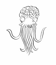
Josh Filhol’s Theoretical Jellyfish
For the project I had tackled before, turning the Fishscale concept into a shareable resource, I had worked with a very talented illustrator and while that was a good working relationship, I found myself frustrated sometimes. And that wasn’t due to his work in any way, shape or form, it was because I felt like I wasn’t making it. It is not that I didn’t appreciate what another person – or in other circumstances a team – can bring to the table. I know that my illustrations wouldn’t have been as good, and there were also a number of things I would simply never have thought of in a million years (the theoretical jellyfish, for example). Plus, I didn’t really have the time to do this project back then, so if it hadn’t been for my illustrator this would never have seen the light of day.
But this new project I wanted to be ‘just mine’. I didn’t realise I felt this strongly about it until one of my colleagues from the Graphic Design department offered to design it for me. I just really wanted this to be my work. And when I thought about why I felt this strongly about it, I realised that I hadn’t really done a substantial project like this in a long time, while I had spent way too much time filling in all sorts of monitoring forms, putting together official documentation and writing research papers. Call me selfish, but I wanted to have some fun!
I also had some very specific ideas of how to design this. I wanted to illustrate it by collaging the patterns that can be found in envelopes from banks, etc. – and there are a lot of different patterns and colours if you start paying attention to these. I didn’t want to do it on the computer, I wanted to put together hardcopy artwork for each of the spreads. I wanted some of the text printed, but some of it to be hand-lettered. And I wanted to have this risographed, which is a particular printing process which means that I would have to do colour separations, too.

Work in Progress
Anyway, these are just details you don’t really need to know for this story, what is important is that I didn’t want to take any shortcuts – and I ended up doing the illustration and layouting with the help of scissors and a glue stick, a rotring pen and a lightbox. And if you start working like this, your relationship with your content changes – and that also changes the content (well, it makes you change the content). You start thinking about text and images together – the layout makes you reconsider your text, maybe something needs to be cut so it fits or there is some more text needed somewhere else; the placement of illustrations changes according to the text you have, maybe to fit paragraphs, sometimes illustrations are just not right anymore and new ways of illustrating bits need to be found. Once I had gotten into the process, this became not just a slight revising of the content, a word here and another there, a sketch on this page moved to the next, no, I rewrote sections significantly. My introductory spread (the text of which you can find here), for example, hasn’t kept anything of the draft I started the design process out with – it’s a different text, it’s different artwork – and it uses a different way to explain the whole thing.
The scary thing is that if I hadn’t gone through the process myself, if I had handed my text and sketches of the images off to somebody else, this wouldn’t have happened. The book would have my original introduction in it, maybe slightly rewritten and certainly a bit pruned, but it would have remained the old version – and the new one is just better (even if I say so myself). The process of designing as well as the time I spent physically making the hardcopies of the colour separations changed not just the appearance but also the content, it gave my thoughts an opportunity to develop further, which has made a better workbook in the end. Not taking the shortcut has meant ending up somewhere slightly different than I expected to, somewhere I believe is better, because sometimes it is worth investing the time to take the long way round.
