As you know I have been thinking about visual ways of representing experiences in patchwork/quilt form for some time. And this had developed quite nicely to what I call the ‘Post-it stage’ (other sticky notes are available) until the idea of the fabric printer moved it into another dimension of possibility. but it still felt a bit vague, and I was thinking that I would like to test this out in a smaller, contained way.
And lo and behold, an opportunity presented itself! I was asked to present a session at an internal conference hosted by our school of education – and ideally something that would give an overview of what I am trying to do with my students. And if I could put together a poster, too…
So having to do a poster anyway, I thought, why not come up with a patchwork design to put on the poster – and then if there is time I could run that through the fabric printer and see how it comes out.
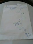
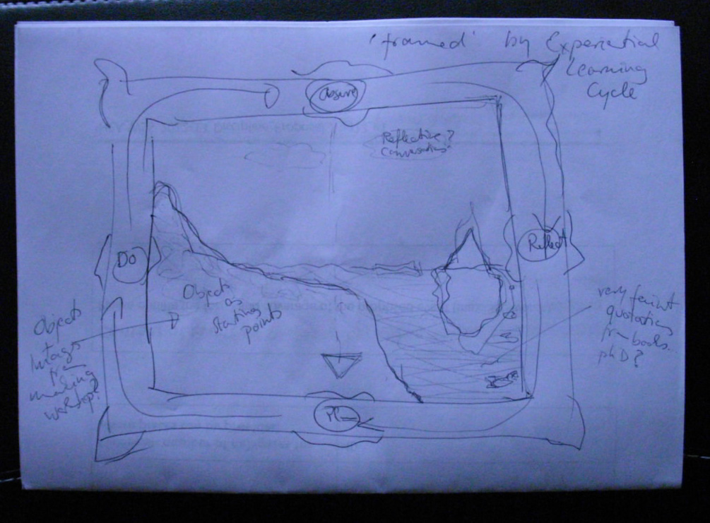
My first idea was inspired by an artistic quilt – so something much more about one large image rather than regularly shaped bits that are joined together. I also liked the idea of using a frame in some way. Sarah has done a poster with a large ornate gold frame in it, which I really like, and I was thinking of nicking that idea and using it to show Kolb’s Experiential Learning Cycle, which in a way is framing almost everything that I do – it sort of provides a really good model of how I approach both teaching and learning. So I was thinking of having a gold frame and on each of the four sides have a little label with one of the four stages Kolb refers to. As the actual image I thought I would use the idea of the Land- and Seascape of Creative Practice, but extend it so that it includes the Underwater Iceberg and the Fishscale of Academicness. A bit complicated, but in my head that still makes sense.

mini quilt concept drawing
And while I still like the idea, I was wondering whether it might be a bit inappropriate because it is very much linked to art and design and takes studio-practice as a starting point. Really what I wanted to do was to come up with a poster/quilt that would prompt me to talk about the actual activities I do with my students (some of them still in development), rather than a lot of theoretical background that might not apply anyway. So maybe square pieces added together to make a larger square image after all?
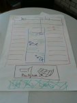
Sitting down again with another large sheet of paper and another stack of post-its I was thinking of how much overlap there would be between the quilt I am planning about the development of my work and teaching philosophy and this one. In a way I wanted this one to be more ‘hands-on’, really focus on analogies and activities I actually use in my teaching, rather than give evidence of inspirations and conference presentations. But I also wanted to include some quotations that might be important.
I took key illustrations from the little tactile academia book(let)s and things I draw on my whiteboard in class as starting points and after some playing around I realised that it might be nice to have a checkerboard effect – with images as one colour and words as the other. After a lot of to-ing and fro-ing I came up with a size and order I liked.

mini quilt at post-it stage
Now it was just a matter of filling it up. I say ‘just’, but of course this took actually quite some time. It is interesting, but it is at this stage, that I might abandon a project. In a way by now it is worked out – and I have a very clear idea in my head of what it would look like if it was actually finished. Of course in that case it would never really be shareable, so it is a good thing to have somebody waiting for a file they can print as a poster and a deadline to boot.
A period of designing began. I started with the images I already had – from the booklets and teaching prep, etc. – but invariably they were all somehow wrong in size or format, so I ended up redrawing most of them. I had some photographs I wanted to include, too. Putting them together just didn’t look as nice as the pink and green post-its, so I decided to treat them so they would all be black and white (well mostly), and so that they were more likely white on black than the other way around, because I wanted to emphasise the checkerboard effect.

the Butterfly Challenge

the Fishscale surface

the Textbook Parrot

the Annotated Bibliography

the Underwater Iceberg

Planning an Essay Introduction
Now all I had to do was populate the in-between spaces. I knew I wanted this to be text based, some squares giving my names for the activities (or books), some of them quotations that underline the importance and relevance of experiential learning (and in extension teaching) and some more informal ideas and activities I use in my teaching. For these three I used different typefaces, but tried to keep the font size equivalent. I also decided on a background colour, going for the colour of this website to make it tie in (and because I didn’t want it just white and couldn’t think of anything better).
And my mini quilt was done! Yippee!
For the poster I did frame it in Kolb’s Experiential Learning Cycle, but in a plain frame. And I added a little bit about the idea of Tactile Academia to the bottom, plus the address to this blog if people want to check out the bibliography especially. (I could have included that on the poster, but would have had to make the type really tiny. Plus, isn’t it a good thing to give all those lovely people a reason to check out this blog?)
With it being the Easter break I don’t have access to the fabric printer just yet, but will keep you posted on how this turns out!