Archive

Tag Archives: research poster

I promised two follow-up posts to the ReGenring17 conference, but as one of them is also related to thinking recently disseminated at the internal Learning and Teaching conference at Staffordshire University, I thought I would put in this little interlude sharing with you what I talked about then.

The use (and possible mis-use) of academic posters is something I have been thinking about a lot recently, so while I have blogged about this previously here, here is a little update on my thinking. This has been informed by looking at a lot of posters in the academic realm from all sorts of disciplines.

Ever since visualisation literacy researcher and designer Lulu Pinney introduced me to the distinction of designing for immersing the audience in a subject or for igniting their interest in the subject, I have looked out for those distinctions. And I think current poster practice can be located along this spectrum – from immersing to igniting. Here are some (stereotypical) examples I have seen over and over again:

The Spineless Report

The Spineless Report

The idea behind this poster is to put as much of the data you collected onto the poster. It shouts “look at all the stuff that I have done! Surely I deserve extra credit for having collected this much data!” This might not be the best way to communicate your findings, but very often students end up with a poster like this, particularly if this is the only assignment they have to do. The text is invariably way too small to read, there is too much of it. Pictures, if there are any included, tend to be too small. This type of poster is truly trying to immerse you in its subject, and if you drown  in all that information, then that is too bad.
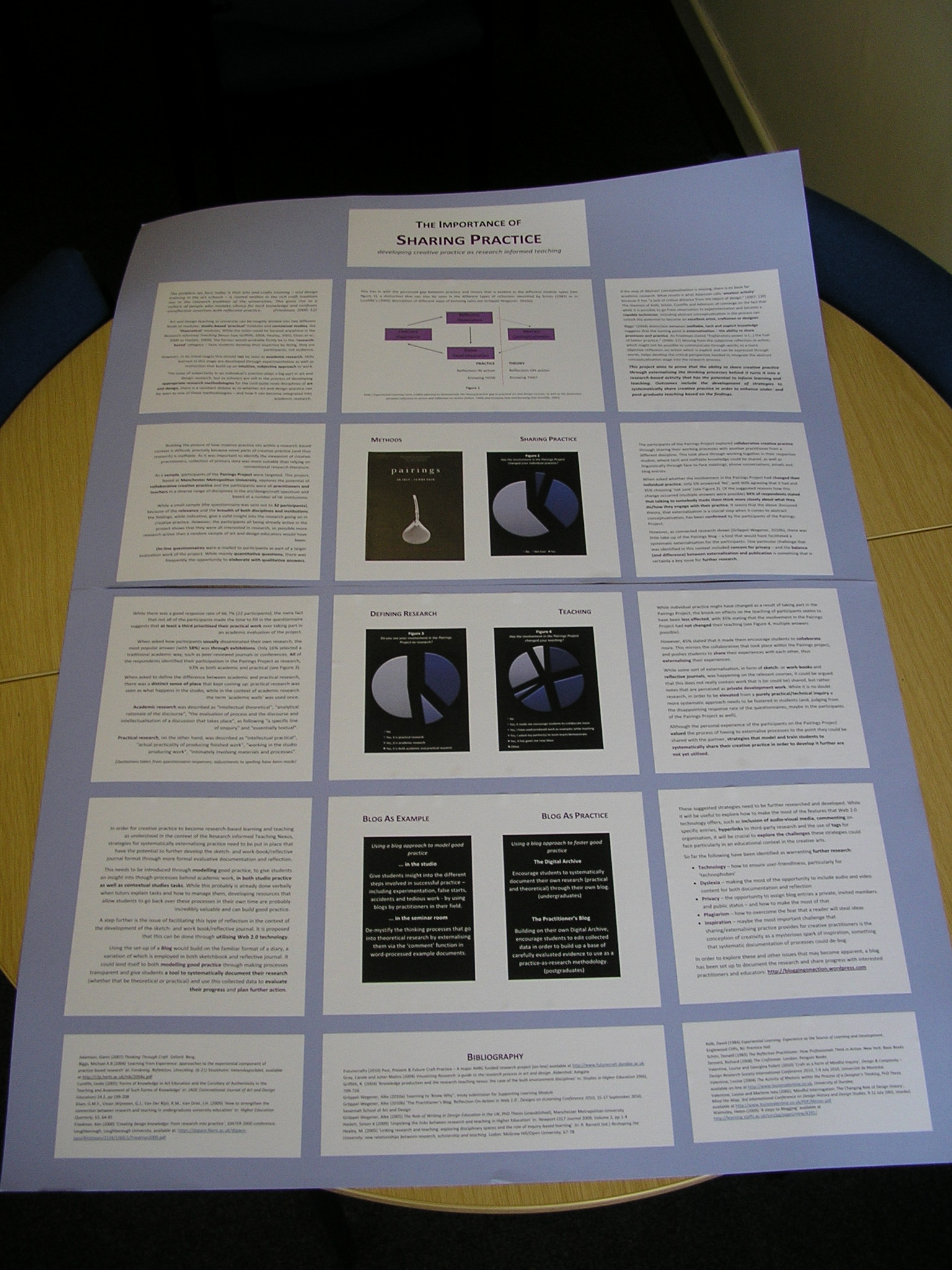
The Box Set

The Box Set

This type of poster follows very clear rules and sections information into boxes. Very often this is based on a template given by the tutor. This is a much more sensible way to use posters in learning and teaching, but again it can often become an exercise in let’s see how much information I can cram into these boxes.

The Infographic

The Infographic

In practice this very often uses smart art from word processing programs, specifically the one that looks most impressive, but not necessarily the one that makes the most sense in the context of the research. However, the infographic format can be really helpful if used correctly – if the student can then avoid the temptation to fill the rest of their poster with text again. And the question remains where to put all the extra research, unless there is another outlet in the assignment mix.

The Visual Metaphor

The Visual Metaphor

This type of poster is dominated by a visual, and adds some text to explain the metaphor as well as extra details.

The Big Picture

The Big Picture

Another type of poster that is dominated by a visual, this time not a visual metaphor, but rather a design or photograph of an actual thing of situation. Text explains the image and adds extra details.

The Poster Spectrum and Higher Education

All of these different examples – and there are probably a few more – have some traits in common. With the genre of the (printed) poster comes the idea of a limited amount of space, usually in a prescribed rectangular size, although the maker might get to choose orientation. With specifying an academic or research poster usually comes the aim of summarising a particular project for a specific audience (that might be experts in the field or lay people, for example). And when academics and researchers put together posters they know their objectives, whether it is to network, tell people about an on-going project or just needed to hand in something so they could attend a particular conference. Based on that knowledge, and of the knowledge of the specific home discipline, it is easy to choose where to locate one’s own poster on the immersing/igniting spectrum.

However, when using the poster format within Higher Education as assessments, this becomes more difficult. I have seen a lot of guidance on academic poster design that highlights the importance of using visuals and being careful not to use too much text. In a way it seems that the advice is to stay away from the immersing end of the spectrum. The assessment acts as another layer of requirement. If the poster is the only assessment required for a course, students have little choice but to go for the immersing end of the spectrum, because it becomes about demonstrating as much of the research they have done as possible. If, however, the poster is part of an assessment mix, then students can afford to not include everything on it, because there will be other opportunities to include those details and information, such as a handout or report, for example. So potentially this will make for less text-heavy posters.

As educators using the academic poster as a learning opportunity for our students, we need to be clear about our objectives in assigning them AND we need to make sure that our students are clear about the aims that the posters themselves have. We need to talk to them about the different types of posters they could produce and the pros and cons each type might bring with it. Because not every poster is alike.

Can you think of any other types not yet included? Please let me know in a comment!


I have wanted to do a post on posters for a while. As somebody with an interest in graphic design who also did a tiny little bit of it as part of her undergraduate degree (specifically designing promotional material for theatre productions), I was always baffled by the academic research poster as a genre. The posters I have come across at conferences are often very dense affairs that are text heavy, and I have often wondered what the point of them was, as whenever I was confronted by a room full of them, my patience for reading dropped from low to non-existent. Let’s face it, a poster session at a conference isn’t really the ideal environment to read…

And then came the time when I had to do a research poster myself, as part of my teaching qualification. I had great plans to do it differently – not much text, very visual, surely that was the way to go. Alas, I stumbled across a problem: this was the only assessment for a module, and while I had about ten minutes to present it, basically the poster was where I had to prove all my knowledge of the subject.

The Importance of Sharing Practice - academic poster 2010

The Importance of Sharing Practice – academic poster 2010

So it got more and more filled up with text while my good intentions stood by feeling powerless; it felt a bit like squeezing all my findings onto an A1 sheet (or however big it was). Looking at it then, I thought this was a bad poster, but at least it showed off the research I had done. Looking at it now, I think it was a really bad poster. The feedback I got mainly was about the content, although it also stated “The graphs on the poster had a positive visual impact from a distance, however, larger fonts or at least headings would enhance the accessibility of the message.” and then “The quantity of information within the poster could be reviewed” (which I am guessing means PUT LESS TEXT ON IT).

Some time later I would come across ‘Spineless Classics’ – a company that designs whole books onto a one sheet poster by the way of pretty miniscule type. In a way research posters remind me of that, trying to squeeze your whole report onto A1 (or A0). But the brilliant thing about Spineless Classics is that they design their layouts in a way that you also end up with an image of (usually) white space that is significant to the book in some way. (You can see some examples here.) Research posters often don’t have that saving grace!

Trying to find out more about the academic research poster – and how to put together a good one – has been a bit challenging, I haven’t been able to find any good guidance beyond the basics that relates to the arts and humanities, maybe because it is more common in the (natural) sciences. But I think that this is an important aspect of practice for any research student – they might get the opportunity to submit a poster to a conference, after all, or just want to develop a visual way to show the development of their project(s).

After getting a bit of funding from my university, I was able to invite visual journalist Lulu Pinney to do a lecture and workshop about research posters for us, which was very well received, incredibly inspiring and I can only recommend. Lulu gave us a lot of practical tips on how to organise a poster, but I think the most important was her mantra to “ignite, don’t immerse”. A poster shouldn’t be a summary of your research, it should ignite people’s interest in your research. I think this is fabulous advice when it comes to designing a poster for a conference.

Unfortunately, however, this could turn out to be terrible advice when it comes to preparing a research poster for assessment. If a poster is the only thing that is assessed, you might have to design it very differently. So maybe the split personality of the research poster comes from us lecturers trying to adjust the ‘assessment mix’. At university we want to test students in different ways, and we want to give them skills that they can use ‘outside’ of the university (or, in case of the research poster, still in academia, but once they have progressed from the student to the researcher role). I would guess that only rarely can a research poster do both effectively.

I also have a theory why. I’m currently reading Daniel Keller’s Chasing Literacy – Reading and Writing in an Age of Acceleration. Keller refers to Lester Faigley’s 2006 chapter ‘Rhetorics Fast and Slow’ in Rhetorical Agendas: Political, Ethical, Spiritual, that argued that there are two different rhetorics: a “fast” one and a “slow” one. The slow one is the one we often try to instil in our students for their academic work. I want my students to read deeply, not just skim over the surface of a text, just as I want them to show deep thinking in their essays, which I expect to be re-drafted carefully a number of times. Fast rhetoric – the web-based digital images, blog posts, e-mails, text messages, instant messaging systems, websites – seems to have little room in traditional academia beyond the initial stages of research (although Keller argues that maybe it should). The tradition of the poster is part of the fast rhetoric – posters are promotional tools, they let us know about events or products, they are designed to get their meaning across in the careless glance the passer-by gives them. The research poster attempts to emulate this, but with the burden of trying to get across the slow rhetoric of the academic research project. And this is the problem. Thinking back to the time I designed that first research poster, I knew that if this was to work as a poster, it needed to be short and snappy. It needed to be utilising a fast rhetoric. I could see what would be lost in the translation. So the ideals of the fast rhetoric became replaced by the learning outcomes (this was, after all, an assignment), and a weird hybrid was created, much more like a ‘spineless’ report.

We need to be mindful of this. Not just when designing our own research posters for conferences, but also when setting posters as assessments. Should they be part of the assessment mix? Absolutely. But they cannot just be used to replace the report, unless we are happy with the level of detail that would be lost in them.

On the other hand, we also cannot judge them in the same way as traditional posters. They are designed by people with different expertise to graphic designers for a different purpose. And that is ok. In Lulu’s workshop we ‘rated’ a number of example posters (that had been done as assessments). As we were all from different disciplines (and because that wasn’t the point), we did not look at the content, but rather at their design, focusing on Impact, Structure and Legibility. When we were done, one of the participants looked at the poster with the highest score and said “but that’s not very creative”. And it wasn’t. It was pretty straight forward. But what it did do was communicating what it was about. It had impact, so that from afar you wanted to step closer and find out more. It was structured well, so you knew where to look and in what order. And it was legible, so that you could actually read the information quickly and easily. Academic research posters shouldn’t be judged by the same criteria than other posters (even if they are prepared by people with a design background), just like they shouldn’t be judged by the same criteria as research reports.

Fishscale - Poster for Cumulus Conference 2013

Fishscale – Poster for Cumulus Conference 2013

Since my first foray into designing research posters (and with the luxury of not having to them to be assessed anymore), my approach to research poster design has changed a bit. I basically design my posters on A4 and then blow them up, thinking that if it isn’t readable on A4, it won’t be readable from a short distance once it is full size at a conference. I also don’t try to put everything in there, this is not my research report or my full paper. If people are interested they can get in touch with me and get more details (if I don’t provide them with all that stuff as a handout anyway). So now I make sure I get my email address on there (which I in the beginning often forgot about) and/or a QR code leading to more information. After Lulu’s workshop I will also have more guidance to get this right and I’m looking forward to putting this into practice.

But maybe more importantly, I don’t use research posters as the single assessment of modules I teach. The one I set really is about the ‘Ignite’, and I state clearly to the students that its purpose is for me to see whether they are able to identify the most important aspect of their research – the main thing they want people to know about. And I can do that because the poster isn’t on its own, it comes with a full report of their projects.

I think this is the way forward to making research poster design better – including both slow and fast rhetorics into the assessment mix, instead of asking the academic research poster to do both. And I would bet that if we all did this, the posters at conferences would get better in a few years!