
After thinking about this workshop, how to present it and preparing for the workshop in more detail, on the 19th June 2018 it was finally here: The Make Your Own Sociological Research Board Game workshop run by myself and Katy Vigurs at the Undisciplining conference organised by The Sociological Review. (A special thank you to Jenny Thatcher, who ran the #Undisciplining conference and went shopping for all the materials!)
Part of the Undisciplining conference is an experiment in live blogging – a dedicated group of people who write mostly short pieces that are either live, written as things are happening, or maybe not quite in the moment, but soon-ish after, which can both describe and reflect on the conference experience, a meta-conference as Mark Carrigan put it in one of these posts. We had Pat Thomson, one of those live bloggers, in the workshop, and you can read her account here. But we thought we should also write our own account and share some pictures – and also to respond in a bit more detail to two of the reflections Pat offers at the end of her post.
But let’s begin with a brief overview of what we actually did…
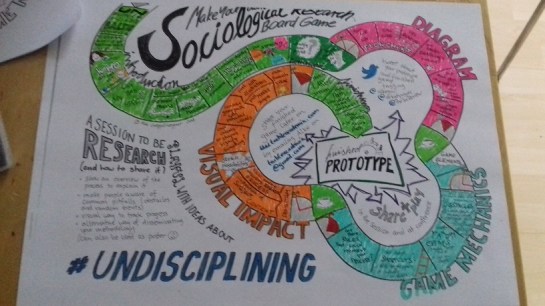
Make your own Sociological Research Board Game handout, coloured in
The main idea behind the workshop was that you can use the well-known concept of a board game as an analogy to illustrate and explain pretty much any process; so why not use it to explain a research methodology? Or, why not use it to explain the running of the workshop itself? Hence the above handout, which uses the aesthetics and linearity of a board game to break down the things we wanted to cover and do in the workshop.
As you can see by the colours, we had four basic areas: the general stuff (in green, with the ‘homework’, the prep we had participants asked to do before they came, in a darker green); as well as the three main areas of our Alke’s approach to board game design: to diagram your process (in pink), to think about possible game mechanics to build in (in light blue/aqua), and to consider the visual impact (in orange). And really those were the things we did. Most of the spaces on the path were really to remind Alke to cover certain things, but she had also added things like the stopwatch visual to remind her of how much time we had allocated for each step. We only had 90 minutes and really wanted people to have a prototype by the end, so there was some careful (and forceful?) timekeeping involved…


…and in the end we had some amazing prototypes in the room! We didn’t have time to share all of them, but here are just some of the ideas our wonderful workshop participants came up with (this is written up a few days after the actual workshop, so apologies if we are getting some of the details wrong):

The Clever Frogs prototype
There were two different approaches the participants took, and one of them was to design a game to teach research skills.
In Clever Frogs students have a frog token/avatar and move from lily-pad to lily-pad to acquire skills (in forms of cards): Critical Thinking (get a pink circle card), Learning a Skill (get a blue square card), Acquire Knowledge (get a green triangle card). If you have a set of three (a set needing one of each type of card, because you need to combine all these skills/tools in your research), you have an ‘output’ when you get to the finish. There were also some chance-type benefit cards included, that potentially help to put together more outputs. And the purpose of the game is to get as many outputs as possible.

Coding Research prototype
The Coding Research approach was a great example of how to put the wide concept of a board game into a more specific context of a discipline. Here the purpose was to teach research skills to coding students, by using the conventions of coding. So rather than having a traditional game path, the ‘board’ contained coding language of the “If…. then…” type with exchangeable elements. So for example in the context of interviews, this could become “If the number of interviews you have conducted is equal to or more than your target number, move on to transcription; if the number of interviews you have conducted is less than your target number, return to arranging interview stage.”

Focus Group Snakes and Ladders
The Focus Group Snakes and Ladders mapped the process of arranging, conducting and analysing focus groups onto a traditional Snakes and Ladders grid. This is a great example of how using simple and established game mechanics (in this case Snakes and Ladders, which most students will be familiar with), can free up students’ minds to concentrate on what you actually want to teach them, in this case about focus groups.

Maze of Streets prototype
Snakes and Ladders was also one of the inspirations behind another example, this one falling into the other category of games being produced: not to teach research skills, but to illustrate and visualise the process of a particular sociological study. Rather than being laid out on the strict squared grid of the traditional snakes and ladders, however, this one was laid out on a board representing a map. This Maze of Streets represented the terrain of the studied sex workers, and showed the difference between safe, well-lit and wide streets in the middle of the board, as opposed to a hinterland of alleys and dead ends. Each step a player takes on the well-lit street brings with them a chance decision (via roll of the dice) on whether you will get a ‘ladder’ (something positive happening that keeps you safe) or a ‘snake’ (something negative happening that makes you move towards the dangerous parts of town). While starting out with the idea of trying to represent the study and its key findings, the creator of this game wondered about using it as a participatory research method for generating individual narratives about the dynamic experience of sex work.

The Heart of the PhD prototype
The Heart of the PhD aims to include the emotional dimension to doctoral research within the board game. It included two sets of ‘chance’ cards, one to ‘Take Action Now’ to tell the player what to do under certain circumstances (e.g. seek advice from the supervisor), and the other one to ‘Have a cheeky Drink’ in order to celebrate doctoral achievements. Extra marks for not just creating a board game, but also including a potential drinking game!

Less than 24 hours later the prototype had moved on already!
So there is no doubt that people found this useful (and fun), and we invited them to let us know about their games’ further progress, so hopefully there’ll be some up-dates one here soon.
At the end of her live post, Pat wondered whether it might be more interesting to make a board game than to play it and whether these two were equally instructive. That is a really good point. We didn’t get to to experiment with test playing the games during the workshop, and for this session really can only comment on the making. Most participants saw their research from a different perspective, and started reflecting (or maybe just noticing) on layers of research processes that often get left out of a written up methodology, but that are part of the ‘messy’ process of actually doing the research. As such there is no doubt that the making is incredibly useful.
Whether these games are actually meant to be played properly is an interesting question. We believe that this depends on your objective for making them. If your purpose is to illustrate a specific process, in the form of a poster, for example, they are less about play. However, if you are using them as a teaching tool, initially playing the game might give students a sense of what conducting this type of research could be like (albeit on a very condensed and safe scale). It shows potential wrong choices and is a form of role playing (a bit like a Choose-Your-Own-Adventure book), which might help students’ research imagination.
Pat also thought “about the pleasures of making and how very rarely in academic conferences there are opportunities for people to use their imaginations and just ‘make stuff'”. We would say, absolutely there should be more making. In the workshops that Alke organises (many of them documented on this blog), she usually starts with getting delegates to make their own name-tags, a great ‘icebreaker’ activity, and that can be a great first dipping your toes into the water for creative making at a conference.
As for this activity, at this conference, while we were doing it @kierancutting tweeted “I’M HAVING SO MUCH FUN #makeyourownsociologicalresearchboardgame #Undisciplining“, and here are some tweets from participants after the 90 minutes we had together:
“This sparked so many ideas I hadn’t anticipated! What a valuable method of social research design and visualisation! Thanks for this lovely learning experience. Also doodling was incredibly cathartic  ” @DrMirnaGuha
“Thank you both for an excellent session!  ” @NelliStav
“Great #Undisciplining workshop making our own sociological board game – fun and very helpful to articulate the research process.” @HRpotential
“Am considering using it as a method to elicit the sharing of personal experiences of youth homelessness – will keep you in the loop!” @kierancutting
“Fantastic workshop making sociological board games with @alkegw & @drkatyvigurs – taking so many ideas back for teaching research methods #Undisciplining” @sal_brown
Consequently, we think this little experiment was very successful and certainly a proof of concept for a longer version. We imagine something that has the time and space to start with playing some board games to get (re-)acquainted with some game mechanics, and then not only making, but also having the time to test play our prototypes. The games produced have shown that using the everyday concept of a board game format has the potential to
- show an overview of the process to explain it to others
- make people (students? funders? participants?) aware of common pitfalls (as part of the obstacles and random events)
- become a visual way to track progress
- function as an alternative way of disseminating your methodology
- become a starting point for discussion and development of the game itself can become part of the methods
So really no excuse not to try it yourself!
Personal note from Alke: Another thing this workshop has shown me is how wonderful it is to have glamorous assistant/PR person/promoter/agent/documenter. It was great to just be able to concentrate on preparing and running the workshop, and have somebody else support all the other stuff. And take all the pictures for this blog posts, apart from the handout (that was by me) and the filled in Heart game (that was from Jessica herself). A gold star to Dr Vigurs – you can be my glamorous assistant anytime!


