Archive

Quilt

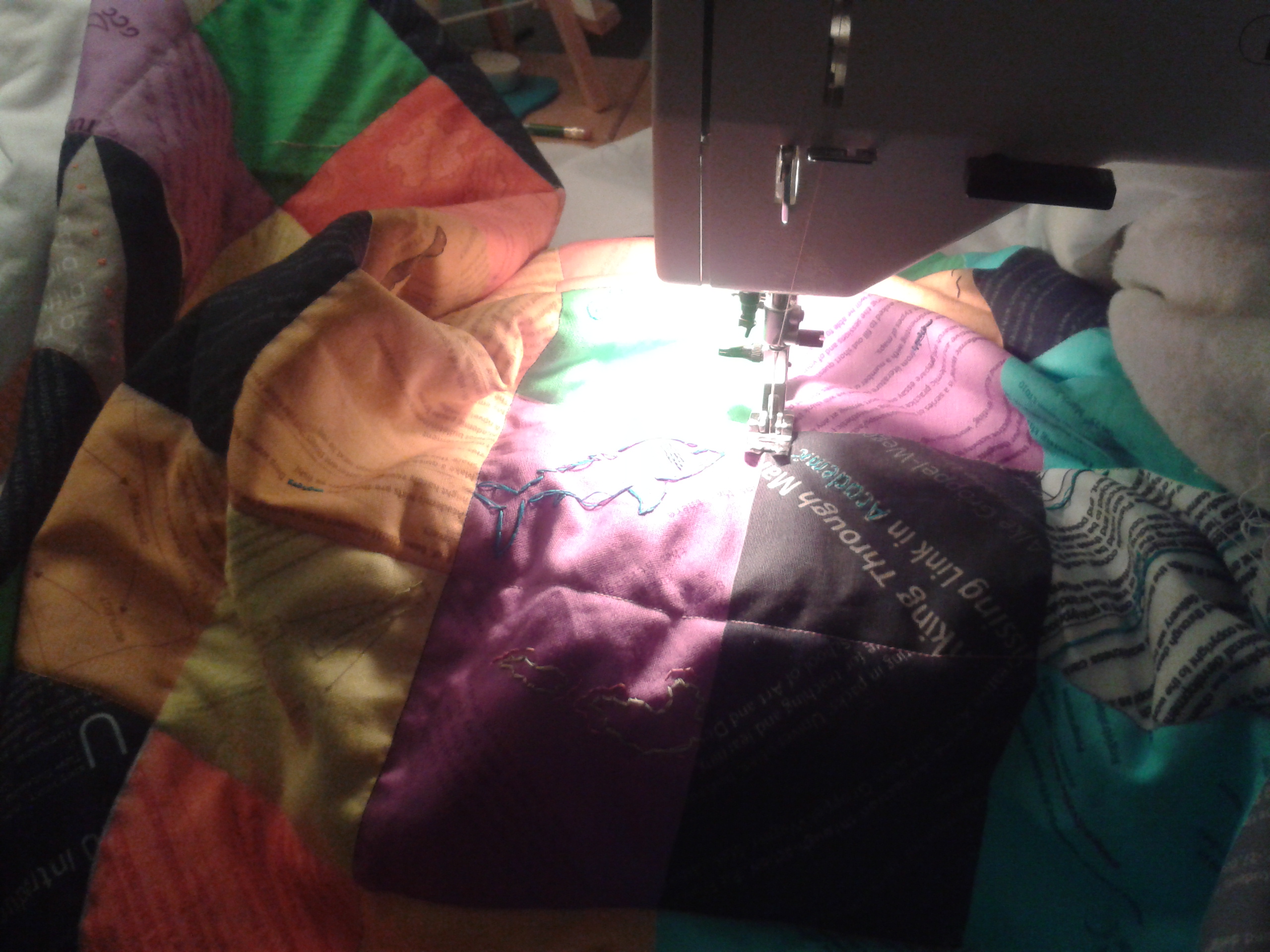
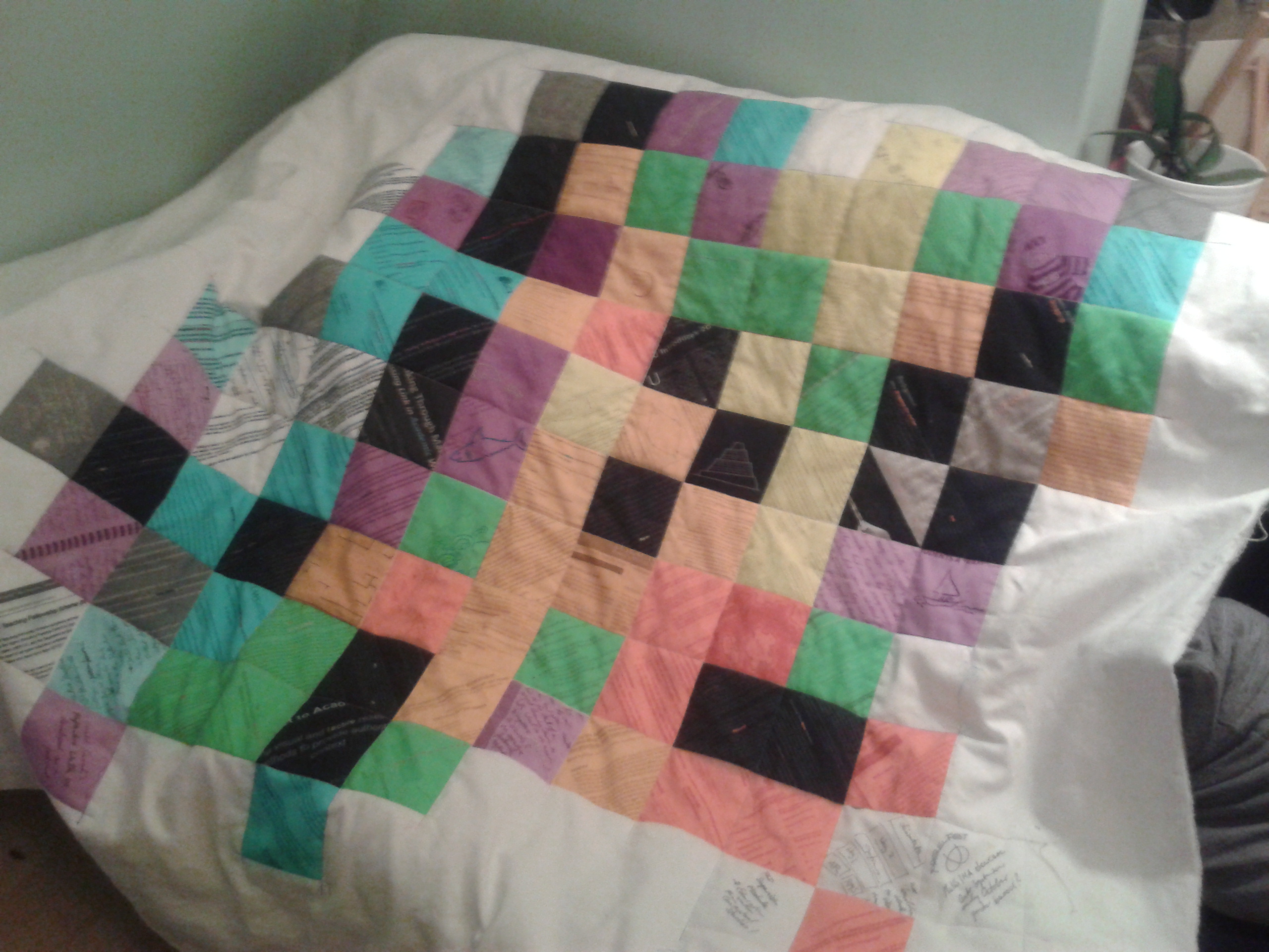
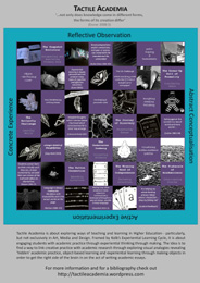
Recently I have been coming across a lot of quilting related stuff. Maybe this is due to my making a (rather conceptually planned) quilt myself (as readers of this blog will know), which made me pay more attention to this, or maybe this is a genuine trend that has finally reached my conscious mind. For me quilting was all around for the last couple of months.

One of the things I find most fascinating about quilters (although really this is way before the quilting stage, so maybe I should better say ‘patchworkers’) is the ‘stash’. That mysterious assemblage of pieces of fabric that you compile while working on projects, carefully saved for the as-yet-unformed projects of the future. Stashes can give their owners a lot of joy, they are full of inspiration and potentially also memories. They can give you a great excuse to buy something gorgeous that is not for a current project, but sometimes you come across something just too good not to get, because you will sure be able to use it in the future for something. Your stash gives you an excuse for completely aspirational purchases – and dreams. (The most recent pieces in my stash were brought home from a trip to Japan, all small bits of vintage kimonos; they are gorgeous, but also very much unlike anything I usually work with – who knows what they will end up in?)

most recent purchases for my stash - pieces from old kimonos

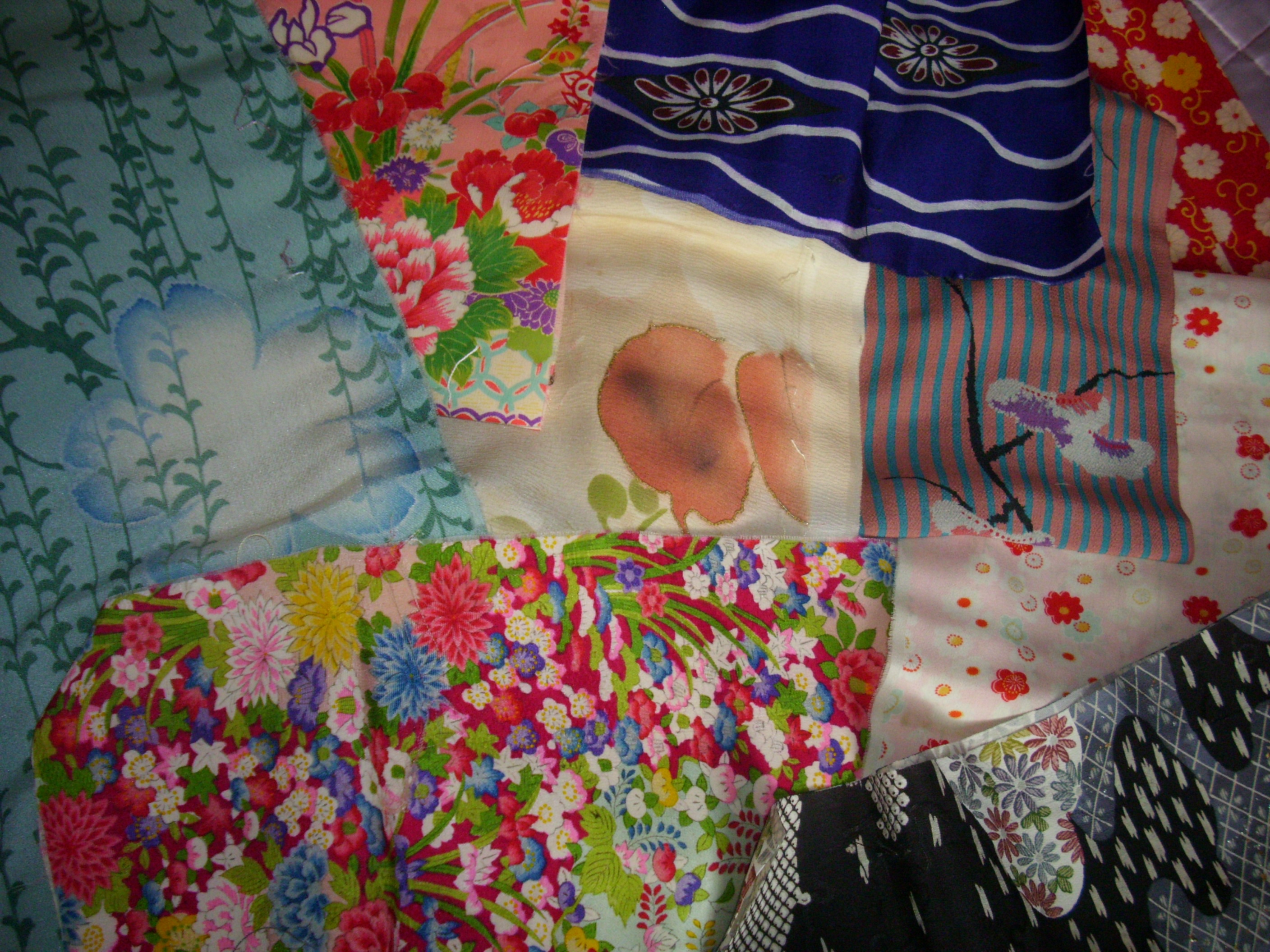
most recent purchases for my stash – pieces from old kimonos

I have a number of ‘stashes’ when it comes to crafting materials (although most of them are not actually in stashes, but in boxes, or better they aspire to be in boxes and one day I will surely get round to organising them a bit better so that they actually are in boxes rather than occupying all sorts of surfaces in my flat, including – I am ashamed to say – the floor), some stashes relate to bookmaking and printing, some to sewing and knitting, some to painting. Some have been accumulated for the sole purpose of running workshops, these include a bit of everything even some random materials.

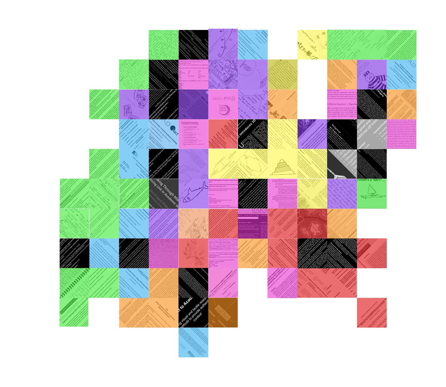
But of course there are also more metaphorical stashes you can find at work, even if you are not working as a quilter. A colleague of mine recently mentioned that she had started a file documenting her achievements so that she wouldn’t forget about them when it comes to putting together submissions for the next Research Excellent Framework (if you’re in UK Higher Education you will know what this means, if you are not consider yourself lucky).  What she is doing is building her stash. When I started thinking about my Learning and Teaching quilt, there were always some patches that represented what I had done, and some that represented ideas to pursue in future. I have recently had to put together a CV and was reminded of how much that is like laying out the pieces of material in a more traditional patchwork stash, thinking about here is what I have, these things go together, these might clash too much, these are too much alike to include all of them.

There is some satisfaction in knowing that it might feel like business as usual most days, but that actually the outcome of these oh-so-ordinary days could be likened to a piece of fabric that one day will help me tell a story by putting a lot of them together. And I find it so much easier of thinking of what I do as little patches of fabric than of lines in the bullet point list of a CV. The great thing about thinking about your career this way is that you can also see what is missing – where do you need a link? where do you need something more colourful and bold? So it becomes a tool for planning, nt just a tool for looking back.

I wonder whether this would be a good way to encourage students to think about postgraduate study?

So, after all the embroidery going on over the last week or so, I declared enough was enough and got out the sewing machine to finally quilt the patchwork.

Quilting the Patchwork

Quilting the Patchwork

As with all design processes I have ever undertaken, it was a good thing that a deadline was looming: the portfolio for HEA accreditation needed to be handed in at Staffordshire University yesterday. And while I had been going back and forth in my head about whether to actually hand in the quilt as part of it or not, I thought it would be nice to have the option. The actual quilting transformed this piece of work, making it look much more ‘finished’ (although it took way longer than I expected it to, I’m glad I did it on a non-work day, because I wouldn’t have been able to complete it in just one evening).

But what about the portfolio? While all the embroidery was going on, I was also busy writing my annotations and sorting out my references. And during a chat with a colleague of mine about the portfolio, he commented on how conversational my writing was and said that on reading the first bits he thought I was going down the interview route. Now, I am ashamed to admit, but this hadn’t really occured to me. It should have, as I do a lot of work with genre writing (lots of cream embroidery on my patchwork), but my initial plan had been to get all the information down (conversationally as I find that easy as a first draft) and thenn ‘academic it up’ with making it more formal. However, if the whole point of the portofolio was to represent my practice, then using a slightly alternative genre made sense.

The finished patchwork side of the quilt

The finished patchwork side of the quilt

So, inspired by the quilt itself,  I set about rewriting the whole thing, turning it into an interview with myself, trying to explain the quilt concept, why there was only going to be one side of it (for now), and trying to guess the questions that might come up while viewing this piece – and answering them. Of course that made me end up with a combination of the annotations and the reflective commentary (which might have gone slightly beyond the word count), but I think I ended up explaining the concept, how it relates to my portfolio of work, and how it is not only reflective practice in action, but also reflecting my practice.

When the time for the decision came, I decided to go with the quilt and interview, rather than just the ‘normal’ portfolio and annotation. And the HEA bag I had from the Storyville conference in May was just the perfect size…

It's in the bag

It’s in the bag

The work on the quilt as such is not finished. I am working on the other side – a map that locates my different practices in relation to each other – and am doing more embroidery on that. And I keep updating my Post-it Patchwork, as this has become a valuable working document that helps me plan future projects.

current state of embroidery on the 'map' side

current state of embroidery on the ‘map’ side

As to how the portfolio was received, I will let you know once I know more…

I have finished the ‘virtual’ patchworking and am working on fabric now – thanks to the lovely technicians at Staffordshire University who printed my file onto a quite substantial cotton.

The Patchwork printed onto fabric

The Patchwork printed onto fabric

The patches are all colour coded – so one purple is for the Tactile Academia stuff, blue for the Writing in Creative practice workshops, black for publications, grey for publications in the works, white for very early publication plans, green for teaching activities, red for administrative/uni stuff, orange for important outside influences and yellow for ‘old’ stuff, i.e. my PhD and things before that. And I am really pleased with how this turned out.

However, to add a bit more interest, I have decided that before I attempt the actual quilting, I am going to add some (very basic) embroidery, picking out the odd word or illustration. The way I choose these colours are based on the content – so really it is another layer of colour coding. I started with the content relating to the Tactile Academia booklets, mainly because there I already had colours picked out: blue for The Fishscale of Academicness, red for The Winning Hand of Independence, yellow for The Button Connection, cream for The Dress-up Doll of Formality (and all sorts of ways of playing with written genre), dark green for The Butterfly Challenge and light green for The Land- and Seascape of Academic Practice. Actually this last one I thought was very complex and deserved two colours really, so I used the light green for the islands as well as anything connected to object-based learning and introduced a pink for the ‘shallow’ waters – and anything connected with the ‘off-loading’ practices of craft (the pink inspired by the Pairings Project, which really should have been more magenta, but I decided to stick with the colours liberated from my grandmothers sewing box rather than buying new ones). You can find a very light blue representing The Underwater Iceberg (a book in  preparation), and orange representing my work on blogging (inspired by the colours of the blog on that which is now defunct).

Since then I have also added dark blue for the work with collage and reflective bookmaking, purple for the overall tactile academia ideas, a light brown for genre that is not written and olive for experiential learning (although I don’t seem to have a picture of that – oops!). I will post soon about the actual quilting of it…

And, just as with the whole process of putting this together, this work has allowed me time to reflect and analyse my work. I have been able to see how the things I do interconnect with each other – and how long I have already been on this journey of ‘Tactile Academia’ without knowing it. This has been particularly useful as I have also been in the process of putting together the portfolio for the accreditation to Senior Fellow of the HEA . Taking the time to work on the quilt has allowed me to see a lot of things more clearly – and it has given me an example with which I can visually and conceptually explain what I do in a learning and teaching context.

As you know if you are following this blog regularly (or by checking out the ‘Quilt’ category if you don’t), one of the projects that I am currently working on is an alternative presentation of my CV/expertise/Learning and Teaching development in form of a patchwork quilt.

After an initial surge of working on it, this had gone through a more fallow period while I was dealing with other stuff, but over the summer I had set aside some more time to work on it. (Although it turned out that I had less time than I thought I would have. Isn’t that always the case?) However, I am happy to report that I not only updated my post-it version to reflect what had happened in the last few months (a great feeling of replacing some dark green post-its that show plans with some other coloured post-its which show things that have actually happened; and then adding more dark green ones!), but also set aside the August bank holiday weekend to do some ‘virtual quilting’. So I made a concerted effort to dig out the information I needed and put it together.

But how to visually ‘code’ this information? The transfer from post-its to representational ‘patch’ actually proved trickier than I had expected. Initially I had thought about finding as many photographic images as possible to represent my patches. But putting them together (virtually with the help of Powerpoint) made the whole thing incredibly busy – and ironically at the same time less interesting.

For a while I got excited by the tactile opportunities a physical patchwork would bring and started thinking about different fabrics, playing with textures. And while that would have worked very well for selected patches, I realised that they would have been only very few, so few they would have been distracting.

In the end I went back to thinking about the post-its. The post-its work as the ‘working version’ because they fit together easily (being all the same size and square) and exactly because they have very little visual information on them: they have black writing or basic sketches on them, while the background is a base colour from a very limited palette. That’s what makes the post-it version easy to read; so that is what I needed in the more elaborate (hopefully to be fabric one day) version as well.

I therefore decided to keep that aesthetic by using bits of text or simple drawings to go on the patches. Most of them set at a +/- 45 degree angle, these squares literally cut out of existing documents give a hint of their content, but also have a clean appearance with a stripey look as opposed to the clutter of visual information photographs would have provided. This also allowed me to set apart external inspirations and influences by again cutting squares from textual/published material, but not setting them at an angle.

In putting together these patches over a couple of evenings, I realised that most of my material can be drawn from a textual base – published articles, abstracts or words on slides, handouts and written notes, although there was also the opportunity to include the odd line drawing. I decided to set apart the ‘future plans’ / ‘in progress’ category by using sketches and hand-written rather than typed text.

By now I was working on Photoshop (a very slow process as I am not a graphic designer and have a very old and limited version of it – it was free, I shouldn’t complain) and it was time to come up with some ‘rules’ for the colour coding. I had decided quite early on to use negative images for externally published papers or events, the white text on black reminding me of so many black cotton conference bags with white logos I have collected. Initially I had thoughts that they would mostly represent logos, but then I realised that where exactly I had been was less important than that it was external and the content. (The ‘where’ could always be taken care of in a separate patch of the UK/world with little beads representing the places papers and workshops were delivered… there’s an idea to follow up on one day!)

So: talks at external conferences and published papers would be white text on a black background. In contrast the papers that are not quite there (written and submitted abstracts, for example, or ideas) I would leave black on white.

The rest of the patches would be coloured like post-its, with the help of the opacity function in Photoshop.

The Writing in Creative Practice workshops, mostly external events funded by the HEA, were very important in the development as a learning and teaching professional, as I was (co)organising most of them, presented my own research and networked with other interested parties. A major staff development activity. I decided to give each of them a separate patch rather than just doing one to represent all of them. As a colour I decided to go for HEA blue-ish.

For the Tactile Academia related things I am going with a purple/lavender colour inspired by this blog, while also being reminiscent of the different Tactile Academia booklets, which are printed black on different colours.

Other colours I needed were for Teaching Activities, External Inspirations/Influences, Responsibilities at university (often linked to admin type work) and important ideas that went back to my PhD research. After I spent a fun weekend playing around with different patches and colours I had come up with this:

a version of my coloured patchwork

a version of my coloured patchwork

I am going to slightly change this – and some patches are still missing – but I have to say I am quite happy with this as a rough version of the patchwork side of my quilt.

Now I just have to make some headway on the other side as well… and get it printed onto fabric… and actually quilt it…

Last Friday I went to Staffordshire University’s Inaugural School of Education Conference. This was particularly interesting in two ways… I had the opportunity to learn a bit more about education research, policy and practice from the education perspective, and, as I was also speaking, I could test out the Tactile Academia ideas on this audience, which is broadening it out a bit as so far I have mostly talked to/worked with people who although lecturers/teachers primarily have an art and design background (like myself).

There was too much going on for me to summarise it here, however, I want to just give one tidbit, which might be interesting for you as I think it links to the Tactile Academia ethos… Jim Pugh did a session on The HE Learning Experience, where he not only recommended Venn that Tune, a book you might also find interesting, but also made us create our own hand-out on Rally Variations. Based on Laurie and Spencer Kagan’s Structures, this not only told us about different types of ‘rallies’ (as in tennis rally, i.e. a sequence of shots) in the classroom, we experienced them in small groups and then were led into how to (visually) record this on a simple hand-out. So he made us not only reflect on the Higher Education Learning Experience for students through what we were talking about, but also about different ways of engaging students in group work, as well as note taking. Definitely food for thought.

me, talking a lot with my hands

me, talking a lot with my hands

After lunch I did my presentation. This was the event I had designed the mini quilt for to put on the poster. Unfortunately I haven’t been able to get it onto fabric yet (students keeping technicians busy with work for final assessments no doubt), but as I liked the visual I decided to actually use it as the basis for my presentation as well. It felt like a very hurried half an hour of me zooming around, briefly describing the different activities. (Some of which I have already blogged about, for example The Land- and Seascape of Creative Practice, which isn’t actually on the quilt, as this is more connected to the framing of the whole thing but it was mentioned in the presentation, or The Fishscale of Academicness, others will follow!)

And I am happy to report that I had a very positive response to these ideas, with a number of people remarking that there were one or two things that they could put into practice almost immediately. I hope that they do and then let us all know how they are getting on.

my poster

my poster

I have since been thinking about how much explanations you need on a poster (or indeed handout). Because I know that if you just have that poster (so all the people who decided to go to the other parallel session) you get very little information about the actual activities. You get slightly odd titles, and some quotations and an overall statement of what Tactile Academia is about, but is that enough? Or is this about right, considering that this is all about getting people curious to find out more – and as long as the blog address is on there, they can do that? I don’t know.

Anyway, the last session I was in was about the importance of networks for Post-Graduate Researchers. While we slightly ran out of time, I started to think about the role that social media can play in that. It made me think a lot about that, in a way also apt, as this blog is one of the ways I stay in touch with you. So I also decided that I would (finally) join twitter. So in future you might hopefully be able to get shorter updates on my research from @alkegw and searching for #tactileacademia.

As you know I have been thinking about visual ways of representing experiences in patchwork/quilt form for some time. And this had developed quite nicely to what I call the ‘Post-it stage’ (other sticky notes are available) until the idea of the fabric printer moved it into another dimension of possibility. but it still felt a bit vague, and I was thinking that I would like to test this out in a smaller, contained way.

And lo and behold, an opportunity presented itself! I was asked to present a session at an internal conference hosted by our school of education – and ideally something that would give an overview of what I am trying to do with my students. And if I could put together a poster, too…

So having to do a poster anyway, I thought, why not come up with a patchwork design to put on the poster – and then if there is time I could run that through the fabric printer and see how it comes out.

My first idea was inspired by an artistic quilt – so something much more about one large image rather than regularly shaped bits that are joined together. I also liked the idea of using a frame in some way. Sarah has done a poster with a large ornate gold frame in it, which I really like, and I was thinking of nicking that idea and using it to show Kolb’s Experiential Learning Cycle, which in a way is framing almost everything that I do – it sort of provides a really good model of how I approach both teaching and learning. So I was thinking of having a gold frame and on each of the four sides have a little label with one of the four stages Kolb refers to. As the actual image I thought I would use the idea of the Land- and Seascape of Creative Practice, but extend it so that it includes the Underwater Iceberg and the Fishscale of Academicness. A bit complicated, but in my head that still makes sense.

mini quilt concept drawing

mini quilt concept drawing

And while I still like the idea, I was wondering whether it might be a bit inappropriate because it is very much linked to art and design and takes studio-practice as a starting point. Really what I wanted to do was to come up with a poster/quilt that would prompt me to talk about the actual activities I do with my students (some of them still in development), rather than a lot of theoretical background that might not apply anyway. So maybe square pieces added together to make a larger square image after all?

Sitting down again with another large sheet of paper and another stack of post-its I was thinking of how much overlap there would be between the quilt I am planning about the development of my work and teaching philosophy and this one. In a way I wanted this one to be more ‘hands-on’, really focus on analogies and activities I actually use in my teaching, rather than give evidence of inspirations and conference presentations. But I also wanted to include some quotations that might be important.

I took key illustrations from the little tactile academia book(let)s and things I draw on my whiteboard in class as starting points and after some playing around I realised that it might be nice to have a checkerboard effect – with images as one colour and words as the other. After a lot of to-ing and fro-ing I came up with a size and order I liked.

mini quilt at post-it stage

mini quilt at post-it stage

Now it was just a matter of filling it up. I say ‘just’, but of course this took actually quite some time. It is interesting, but it is at this stage, that I might abandon a project. In a way by now it is worked out – and I have a very clear idea in my head of what it would look like if it was actually finished. Of course in that case it would never really be shareable, so it is a good thing to have somebody waiting for a file they can print as a poster and a deadline to boot.

A period of designing began. I started with the images I already had – from the booklets and teaching prep, etc. – but invariably they were all somehow wrong in size or format, so I ended up redrawing most of them. I had some photographs I wanted to include, too. Putting them together just didn’t look as nice as the pink and green post-its, so I decided to treat them so they would all be black and white (well mostly), and so that they were more likely white on black than the other way around, because I wanted to emphasise the checkerboard effect.

Now all I had to do was populate the in-between spaces. I knew I wanted this to be text based, some squares giving my names for the activities (or books), some of them quotations that underline the importance and relevance of experiential learning (and in extension teaching) and some more informal ideas and activities I use in my teaching. For these three I used different typefaces, but tried to keep the font size equivalent. I also decided on a background colour, going for the colour of this website to make it tie in (and because I didn’t want it just white and couldn’t think of anything better).

And my mini quilt was done! Yippee!

For the poster I did frame it in Kolb’s Experiential Learning Cycle, but in a plain frame. And I added a little bit about the idea of Tactile Academia to the bottom, plus the address to this blog if people want to check out the bibliography especially. (I could have included that on the poster, but would have had to make the type really tiny. Plus, isn’t it a good thing to give all those lovely people a reason to check out this blog?)

With it being the Easter break I don’t have access to the fabric printer just yet, but will keep you posted on how this turns out!

With the starting point of my quilt sorted, I want to started organising the next pieces in a spiral going outwards. As the first piece referenced my PhD, I thought the first round would be a good idea to represent important ideas that came out of the PhD which I still use or which have really influenced my understanding of learning and teaching.

Here some images of how these pieces might be represented in the quilt.

Roughing, Shaping, Polishing. This piece refers to a text by Barry Wellman (‘How to Write – and Edit – a Paper‘), which talks about the different stages of writing, roughing, shaping and polishing. I think that this is particularly apt, as this could really also represent the stages of designing, and I have used this to get students to link the process of writing to the design process ever since. And when I designed my first module introducing students to academic writing, I put in three workshop/seminars based around these three main stages.
Ideas about Writing. This was the title to one of my first lectures to second year students. On a handout I had four different descriptions of objects, really it was to make students think about what you can do with words and how you can frame your reader’s expectation and even build suspense by the way you are describing something. One is one of the best descriptions of an objects that I have ever come across – the fishbowl in Douglas Adams’ So long and thanks for all the fish; one was a description/review of Aalto’s Savoy vase from The Times by Hugh Pearman; one was an introduction to the usefulness of towels from The Hitchhiker’s Guide to the Galaxy and the last one was a section from Jasper Fforde’s Lost in a good book, where an art work is described, which turns out to be … I don’t want to give it away, shall we say an object commonly found in the kitchen.
Wonders and Blunders. The first non-threatening writing task I set my students was asking them to write about something they loved and something they hated – and explain why – inspired by the ‘Wonders and Blunders’ column in The Guardian. This was the first genre writing I asked students to do, including writing their own byline and short biography, as well as including pictures to mimic the examples as much as possible. The students came up with some amazing examples, the stand-out probably nominating ‘Christmas’ as a wonder and ‘January’ as a blunder.
The Big Idea Postcard. This was a task that I used to replace an outline students had to write for their proposed work (and report) at the beginning of their third (final) year. It was meant as a prop for a presentation as part of a group tutorial, but also gave them the opportunity to think about the larger context of what they wanted to achieve, before scaling down their projects into something that was ‘doable’ with the time and resources available. Using the postcard model prompted students to use both words and images to represent what they wanted to explore; it was non-threatening, because it was fairly small, so a manageable task; and it also made them focus, because of the limited space available. Feedback for this activity was good from both the students and staff (who found that the quality of the explored ideas went up), and I am (still) using this as a starting point for essay writing in my current teaching.
The 2d Challenge. This was probably the ‘biggest’ piece of work that I tested for the PhD. It was a task for second year students to imagine their work as a newspaper or magazine and produce a sample copy of it. There were certain elements that needed to be included, such as an element that described their own practice and an advertisement or review of something they had made on the course (and their ‘Wonders and Blunders’ task, although they could rewrite that), but overall it was a ‘blue sky’ project, i.e. students were encouraged not to feel restricted by ‘the real world’. I feel that this was a really successful task, not only did it get students to write in a rather sneaky way, because obviously they had to fill up their publication, it also made them really think about their aspirations (and made them discuss/share them with the staff). My favourite example was of a student who came into a tutorial to say that he had no idea what he could use, he wasn’t reading any magazines, and overall he seemed a bit lost on the course. So I asked him what he did in his spare time (skateboarding) and whether there were any publications related to that he sometimes read (yes, regularly) and I encouraged him to maybe use them as a starting point. By being given permission to include his hobby, he made the link between that and the course he was on (3 Dimensional Design) and produced a sample copy of a skater magazine that featured an article on the aesthetics of concrete in a half-pipe. In his third year he went on to use concrete as a material!
Writing PAD case study. During this time, I also came across the Writing-PAD network (at the time this was still a HEFCE funded project), and one of my first publications was writing the 2D Challenge up as a case study for their website.
Action Research Spiral. One of the most important concepts for both my PhD (where it provided me with the starting point of a structure for my thesis, see previous post on The Spiral) and my understanding of how research, writing and design can be modelled was the action research spiral. My initial encounter was through Swann’s ‘Action Research and the Practice of Design’ in Design Issues 18:2 (2002), who quoted Zuber-Skerritt’s Action Research in Higher Education: “In brief it is a spiral of cycles of action and research consisting of four major moments: plan, act, observe, and reflect. The plan includes problem analysis and a strategic plan; action refers to the implementation of the strategic plan; observation includes an evaluation of the action by appropriate methods and techniques; and reflection means reflecting on the results of the evaluation and on the whole action and research process, which may lead to the  identification of a new problem or problems and hence a new cycle of planning, acting, observing and reflecting.” (1992) A linked model is Kolb’s Experiential Learning Cycle, which will be referred to in future pieces of the quilt.
Futureground Conference. This was my first presentation at an international academic conference (and I was lucky enough to go to Australia for it). Held at Monash University, Melbourne, Futureground was one of the conferences of the Design Research Society. My paper was called ‘Is Writing a Design Discipline?’ and summarised the findings of my PhD.

I have been doing some more work on the quilt – and have introduced a little more colour-coding…

quilt mock-up now with colour coding

quilt mock-up now with colour coding

I took it to my appraisal, and am happy to report that my line manager liked it (and the idea), although she pointed out that really I am talking about a patchwork… In one sense that may be true, but I will keep referring to this as a quilt, because even though this layer I am designing is a patchwork of sorts, the thing about the quilt is that it is thick, because it has that lovely layer inside. And this piece needs to be substantial, so once I am ready to join it to the subject specific side, there will be quilting contained to make it nice and warm.

But more than anything, I just really like ‘quilt’ as a word. It’s only one letter removed from ‘quill’, which could link it to the writing side of it. I feel the title of a paper coming on: “From quilt to quill, how a visual patchwork can organise and prepare reflective writing” – maybe not quite there yet…

P.S.: I also managed to find out that my university has a newly acquired textile/fabric printer, so making it doesn’t seem out of reach anymore (but let’s design it first). how exciting is that!

The Spiral - initial centrepoint of my quilt

The Spiral
initial centrepoint of my quilt

This piece represents the core of my PhD, which ended up being about The Role of Writing in undergraduate Design Education in the UK and was the first time I properly came in contact with Higher Education from the teaching side.

The spiral itself represents the structure I had in mind – I was trying to turn Kolb’s Experiential Learning Cycle into three dimensions, which represents the research process as well as both the design and writing process (one of the points I made in the PhD). I used little images of it to preface chapters, always highlighting where in the spiral the reader was at this point.

I like the idea of this, a spiral that gets tighter and comes to a point as the focus of the research becomes clearer, becoming the starting point of an outgoing spiral, as the (initial) centre point on my quilt. And while I didn’t end up in Higher Education for a couple of years, this was the spark that in the end did start my current career (and got me my job).

I realise this might not remain in the middle of the quilt, but for now I will work outwards in a spiral…

So I have started planning my quilt.

I did this by first investing in a stack of mulit-coloured post-its (other sticky notes are available), and trying to note down significant incidents in my learning and teaching career one per post-it. Some of them are things that I do with students, some of them are presentations I heard or workshops I attended, some of them are things I have published, some of them are people I have met and subsequently collaborated with. And some of them are things I want to do in future.

After the first rush of ideas had gone, I went over my CV and added things I had forgotten about. And then I started arranging the pieces on my living room wall. And then I rearranged them. As they started falling off the wall I switched to a large piece of paper on the floor, which ended up as two papers side by side.

I have since rearranged my ‘layout’ a number of times, added some pieces, taken away others (I wanted this not to be about every little thing I have done, but rather about the things I at the moment consider significant). And this has already been really helpful! I am now more aware of how a lot of the bits I do connect to each other. And I can see what direction I have most recently worked in much more than in others. I think I am much clearer now as to what I want to achieve, and how the things I plan to do link together.

Starting off on this has also made me consider the process of putting the quilt together:

  • As mentioned above, only things I consider significant now, otherwise this would be far bigger (and say far less I fear)
  • I got rid of the pieces linked to subject-specific knowledge. This goes back to my thinking about the Accreditation Quilt, while subject-specific knowledge is of course important to a teacher, the learning and teaching skills are somewhat separate. What I am thinking is to represent subject-specific knowledge on the back of the quilt. And I don’t think that is going to be a quilt for me, that will be a whole picture, because by its nature I consider this much less ‘bitty’.
  • After this first flurry of activity (which always seems to happen when I have stumbled across a new idea I think might work), I think this also needs some back-up. At the moment the pieces are very sketchy notes to myself, some of them as images, but most of them containing key words or titles. In order to fully appreciate what the pieces represent and how they are fitting together, I need to design them to actually become representations – and then reflect on why I decided to put them here and not there. That could then also be used as a starting point to present my learning and teaching career to somebody else (if I go on and present this as an Accreditation Quilt, for example).

It is this ‘backing up’ of ideas that will get me to where I want to be, and that will show the Thinking through Writing and Making process I am so keen to explore further. So while this collection of post-its will come to my appraisal later in the week, the thinking process will continue while I redesign the pieces and write about them, at least some of it shared on this blog in future.