
Tales of Virtual Quilting and Post-It Aesthetics
As you know if you are following this blog regularly (or by checking out the ‘Quilt’ category if you don’t), one of the projects that I am currently working on is an alternative presentation of my CV/expertise/Learning and Teaching development in form of a patchwork quilt.
After an initial surge of working on it, this had gone through a more fallow period while I was dealing with other stuff, but over the summer I had set aside some more time to work on it. (Although it turned out that I had less time than I thought I would have. Isn’t that always the case?) However, I am happy to report that I not only updated my post-it version to reflect what had happened in the last few months (a great feeling of replacing some dark green post-its that show plans with some other coloured post-its which show things that have actually happened; and then adding more dark green ones!), but also set aside the August bank holiday weekend to do some ‘virtual quilting’. So I made a concerted effort to dig out the information I needed and put it together.
But how to visually ‘code’ this information? The transfer from post-its to representational ‘patch’ actually proved trickier than I had expected. Initially I had thought about finding as many photographic images as possible to represent my patches. But putting them together (virtually with the help of Powerpoint) made the whole thing incredibly busy – and ironically at the same time less interesting.
For a while I got excited by the tactile opportunities a physical patchwork would bring and started thinking about different fabrics, playing with textures. And while that would have worked very well for selected patches, I realised that they would have been only very few, so few they would have been distracting.
In the end I went back to thinking about the post-its. The post-its work as the ‘working version’ because they fit together easily (being all the same size and square) and exactly because they have very little visual information on them: they have black writing or basic sketches on them, while the background is a base colour from a very limited palette. That’s what makes the post-it version easy to read; so that is what I needed in the more elaborate (hopefully to be fabric one day) version as well.
I therefore decided to keep that aesthetic by using bits of text or simple drawings to go on the patches. Most of them set at a +/- 45 degree angle, these squares literally cut out of existing documents give a hint of their content, but also have a clean appearance with a stripey look as opposed to the clutter of visual information photographs would have provided. This also allowed me to set apart external inspirations and influences by again cutting squares from textual/published material, but not setting them at an angle.
In putting together these patches over a couple of evenings, I realised that most of my material can be drawn from a textual base – published articles, abstracts or words on slides, handouts and written notes, although there was also the opportunity to include the odd line drawing. I decided to set apart the ‘future plans’ / ‘in progress’ category by using sketches and hand-written rather than typed text.
By now I was working on Photoshop (a very slow process as I am not a graphic designer and have a very old and limited version of it – it was free, I shouldn’t complain) and it was time to come up with some ‘rules’ for the colour coding. I had decided quite early on to use negative images for externally published papers or events, the white text on black reminding me of so many black cotton conference bags with white logos I have collected. Initially I had thoughts that they would mostly represent logos, but then I realised that where exactly I had been was less important than that it was external and the content. (The ‘where’ could always be taken care of in a separate patch of the UK/world with little beads representing the places papers and workshops were delivered… there’s an idea to follow up on one day!)
So: talks at external conferences and published papers would be white text on a black background. In contrast the papers that are not quite there (written and submitted abstracts, for example, or ideas) I would leave black on white.
The rest of the patches would be coloured like post-its, with the help of the opacity function in Photoshop.
The Writing in Creative Practice workshops, mostly external events funded by the HEA, were very important in the development as a learning and teaching professional, as I was (co)organising most of them, presented my own research and networked with other interested parties. A major staff development activity. I decided to give each of them a separate patch rather than just doing one to represent all of them. As a colour I decided to go for HEA blue-ish.
For the Tactile Academia related things I am going with a purple/lavender colour inspired by this blog, while also being reminiscent of the different Tactile Academia booklets, which are printed black on different colours.
Other colours I needed were for Teaching Activities, External Inspirations/Influences, Responsibilities at university (often linked to admin type work) and important ideas that went back to my PhD research. After I spent a fun weekend playing around with different patches and colours I had come up with this:
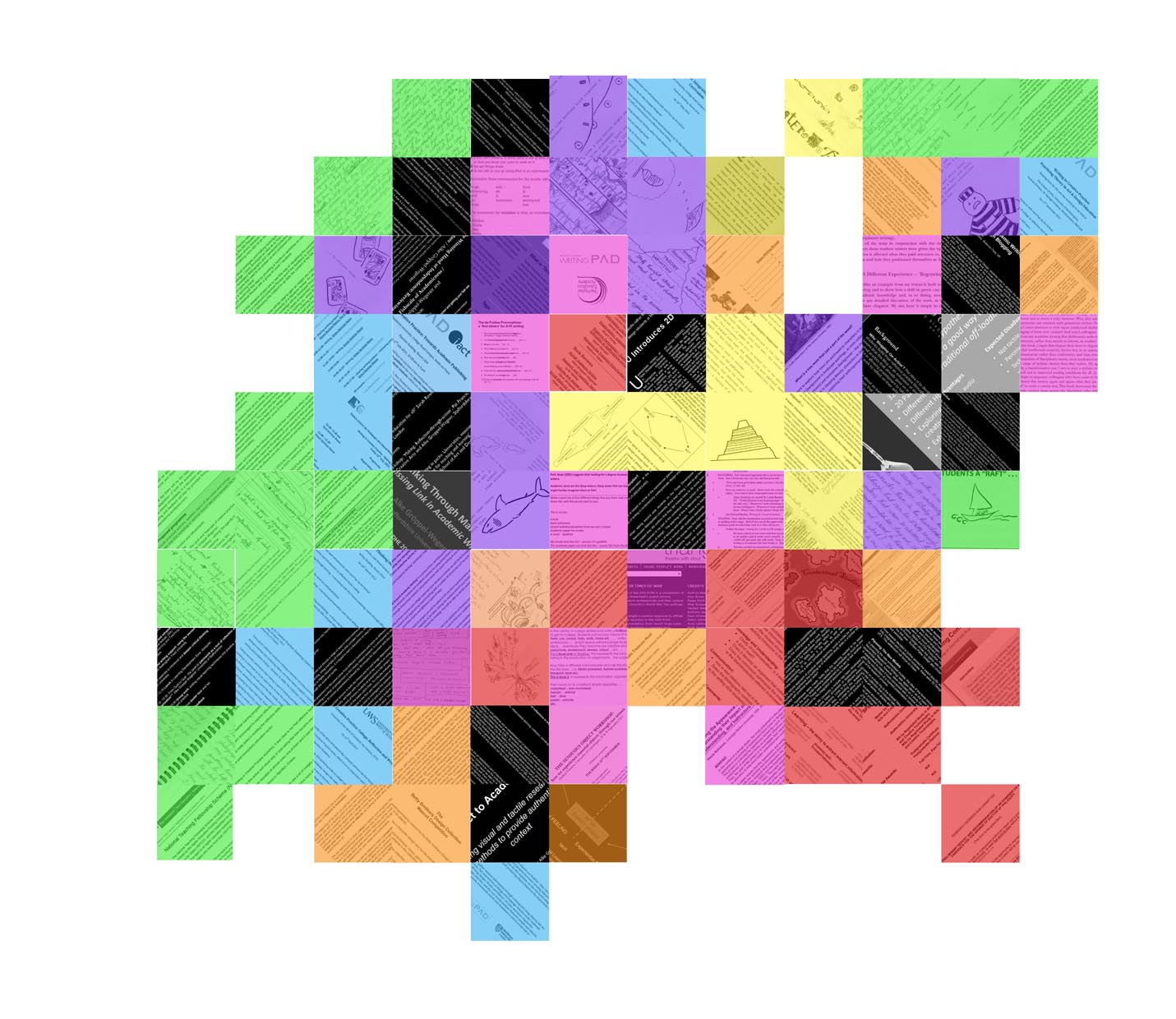
a version of my coloured patchwork
I am going to slightly change this – and some patches are still missing – but I have to say I am quite happy with this as a rough version of the patchwork side of my quilt.
Now I just have to make some headway on the other side as well… and get it printed onto fabric… and actually quilt it…
