Archive

Author Archives: alkegw

As you might know, I am currently putting together a workbook for students that collects some of the visual analogies I have been using in my teaching. I have been getting some questions about what is meant by ‘visual analogies’ and how that would translate into a book on academic writing as part of my Kickstarter campaign to raise funds to print some copies (and until the 7th May 2015 you can support this by pledging for your very own copy here). So in order to give people a better idea, here is the introduction (I will add a picture of my layout soon):

Here’s the trouble with writing academic essays at degree level: if you haven’t been to university before, you probably haven’t done it before. You will have written all sorts of things:

  • emails,
  • letters,
  • short stories,
  • social media up-dates,
  • blog posts,
  • txts,
  • reports
  • and much much more.

You might even have written essays, but if you haven’t been to uni before, you probably haven’t been writing the sort of essays that university lecturers are looking for. This might be a problem, because when they say ‘essay’ you hear ‘essay’ – but you are both talking about different things. Because quite a lot of what makes up an academic essay is specifically academic practice – using research to rigorously back up your argument, including evidence to back up your points – and even writing it to a specific blueprint.

To make matters worse, some of this practice is ‘hidden’,- academics do it, but it has become such second nature to them that they forget how to explain that they are doing it (and/or how they are doing it).

An essay might seem like a straight line when you are reading it, but really it paints a picture for the reader, a bit like a connect the dots drawing. The further you read, the more defined it becomes, and once you are finished you can see the whole picture.

Writing an essay is a bit like planning a connect the dots drawing. Only because this is research you don’t make up the image, you first find it within the evidence you consult. That means you first have to identify lots of evidence you could use, because you have to find a lot of possible points. While you are doing that you might go round and round in circles and squiggly lines, there is no real order yet, you are exploring at this stage.

Then you go through a process of ‘curation’ – you figure out what your argument is and what points you need in order to make it. This will mean looking at all the dots you have and getting rid of the ones that don’t fit into your picture.
Now you might see that there are some holes in your argument – you might need to find some more points, by doing more research.

Once you have all the dots identified that you need to show your picture you need to order them. You want your image to slowly emerge – just like you need to build on one point after the other in your essay. For your connect the dots drawing this means replacing the individual dots with numbers. For your essay it means ordering your points and writing it up accordingly.

So you as writer (and really researcher) find the evidence, identify the argument and then present it in a way that it effortlessly appears to the reader.

All these stages that go into this planning process are hidden from the reader. But for the essay to work the writer needs to go through them. This workbook is all about getting you to understand this ‘hidden’ academic practice – in a hands-on way. It contains sections to explore these stages from a number of perspectives, in the form of visual metaphors and analogies which are designed to highlight specific, important aspects of academia. Most sections also include something for you to do. Sometimes that is something you can complete in the book itself, sometimes something to keep inside envelopes inside, and sometimes (particularly towards the end) it is something to include in your next essay draft. And yes, there should be more than one draft! Just like anything else, essay writing is something that needs to be practised. That’s why a lot of things here are for you to try out, little projects to get you working on this regularly, because the more you work on it, the better it will get.

So let’s get started…

For quite a long time I have been trying to find a way to develop some more help with essay writing for students. I think there are some fantastically good resources out there for post-graduate students, but the basics of a simple essay – not a thesis – seem to be somewhat neglected unless you count fact sheets from different Higher Education Institutions, which can feel both corporate and somewhat boring. And even then there is often little explanation of what I refer to as ‘hidden’ academic practice, the thinking processes and conventions that make an essay at degree level different to an essay at school.

What was needed, I felt, was a sort of ‘painting by numbers’ approach to essay writing – simple, step by step, visual, colourful – and fun! So this week I am happy to launch my ‘Writing Essays by Pictures‘ project.

Some initial sketches for the Writing by Pictures blog

Some initial sketches for the Writing by Pictures blog

There are two different, but somewhat linked, resources – a blog, Writing by Pictures, which you (and your students) can find here. This is really an extension of the idea of the visual soundbite – last term I asked students to regularly reflect on what they had learned during our sessions and put them into a visual soundbite, and I have to admit that I was quite surprised by what they came up with. Not at all the things that I had wanted them to take away from the sessions! So I decided to make a list of all the tips and tricks that I had hoped they would pick up on and put them on this blog.

The second project is linked, but is for the times when the dip-in-and-out approach of a blog is not enough. Instead I tried to put together a step-by-step guide to essay writing as a workbook, which also included some activities, so really this can be used to work through the research and writing process from the beginning of their essay to

Initial stages for the Writing Essays by Pictures blog

Initial stages for the Writing Essays by Pictures book

the finished product. Called Writing Essays by Pictures, I have produced a draft of this workbook and shown it to some colleagues who have been very positive about it. I am now in the process of raising money on Kickstarter to print some copies to get them to students to actually test.  If you want to find out more – and maybe ven support it, check out the page for the campaign here.

While neither of these resources are finished yet, please do share them with people who might be interested. Over the next few months I will add more images to the blog, clean up the images that are there and also add some more content. The workbook will be finished and hopefully go to press in May/June. As I don’t want the posts on the progress of this big project to dominate this blog, I have made a new page which you can check for progress if you are interested.

from Lucy Brown

I’m currently embarking on a new journey – one that seeks to navigate a way through the woods of ‘academia’. Having been teaching now for 6 years, the word has sat quietly on my shoulder whispering of its prowess and stature, yet I’ve struggled to find a straight answer with regards to how to begin to find my way through its seemingly impenetrable mass of trees. In taking up a new post at Staffordshire University earlier this year, I was determined to conquer it and with some research under my arm and a tactile approach to pedagogy in tow I set off hoping to meet a guide along the way.

Several days into my journey, I met Alke, the author of this fine blog. She writes, “the different ‘hats’ I wear – teacher, researcher, writer, designer, artist – … all weave together to one identity.” “Finally,” I say to myself, “I’ve found my guide.”

Alke has kindly invited me to contribute to this online space, and I find myself at the first stop on my map. I’ve shared this small anecdote with you all in the hope of encouraging those new to the academic landscape – it’s simply a case of one step at a time!


Walk

Walk

In 2014 I completed a pedagogic research project on the MA Graphic Design course at London College of Communication. The research discusses a tactile, visual metaphor for an increasingly prevalent issue within art and design education, culminating in a series of practical workshops entitled ‘The Non-Linear Workshop Series’.

Research Title:
Beyond digital technology: introducing undergraduate graphic design students to the non-linear landscape of the creative process.

Many undergraduate graphic design students struggle to explore the landscape of the creative process in a ‘non-linear’ way, due to the dominance of digital technology on their life thus far, which increasingly encourages a ‘linear’ mode of thought.

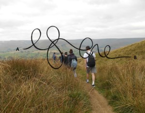
For example, the undergraduate graphic design creative process has a tendency to map as follows (particularly at entry-level):
A) Brief to B) Solution (via Google).

Palfrey (2010 p.6) writes, “Digital Natives are coming to rely upon this connected space for virtually all of the information they need to live… Research means a Google search… they simply open a browser, punch in a search term, and dive away until they find what they want — or what they thought they wanted.”

In my research question, I have used the word ‘landscape’ as it means ‘all the visible features of an area’, or ‘the distinctive features of a particular situation or activity’. Many entry-level students are blind to the ‘visible or distinctive’ features of the non-linear creative process, and unaware of the options with regards to how and why they should traverse its landscape. They have grown up in an age of linear immediacy — of the digital Google map that tells them where to go. The Non-Linear Workshop Series uses a physical landscape as a metaphor for the exploration of this idea.

In addition, I have used the phrase ‘beyond digital technology’ with the intention of suggesting ‘more than, exceeding, in excess of, above, over and above, above and beyond, upwards of’ as opposed to ‘on the other side of, further away than, behind, past, after or over’. I recognise the value of the Internet as a research tool, yet the Non-Linear Workshops Series aims to teach students to know how to ‘go beyond’ it.

Choice is now linked to risk (Salecl, 2013) and therefore causes anxiety. Notions of non-linear creative ‘travel’, visual exploration, wandering and at times becoming lost seem irrelevant and frightening to many, meaning that the development of a non-linear creative process is culturally challenging. A colleague of mine recently overheard a student say: “If it’s not on Google, it doesn’t exist. Everyone knows that.” The Non-Linear Workshop Series aims to readdress and refresh the methods through which the non-linear landscape of the creative process is introduced to entry-level students in an effective and relevant manner, considering the linear nature of their digitally dominated lives. Palfrey writes:

“The innovative use of technology leads to a ‘copy and paste culture — a practice that is in tension with traditional educational ethics… In order for [educational institutions] to adapt to the habits of Digital Natives and how they are processing information, educators need to accept that the mode of learning is changing.”(Palfrey: 2010, p.239)

The Non-Linear Workshop Series

The Non-Linear Workshop Series presents ‘A) Brief, to B) Solution’ as a visual, tactile, focal point, and encourages undergraduate graphic design students to question and explore how exactly they traverse from A to B, along with what their journey might look like in relation to ‘linear’ or ‘non—linear’ form.

Lines

Lines


Workshop 1 of 7: Context
The first aspect of the workshop series introduces the students to the context of the research in an appropriate, simplified manner through the group discussion of a short text and series of questions. The students are able to grasp and engage in the research proposition easily through this method, enabling them to ‘want’ to learn more through realising a ‘need’ to engage in the subject matter.

Workshop 2 of 7: Non-Linear – Define
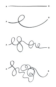
The second aspect of the workshop series enables students to begin to unpick and understand the meaning of ‘non-linear’. The workshop begins with a brief whereby students write down their initial understanding of the meaning of ‘non-linear’, before investigating further. This enables the discussion of the nature of Google-led research through the drawing of a line within a given template. Formal definitions of linear and non-linear are then provided to conclude the session.

Workshop 3 of 7: Non-Linear – Make
The third aspect of the workshop series asks students to generate varying forms of line during a 1 day workshop. Students use varying tools and mark making methods to do this. The lines generated provide further visual impetus through which to discuss the development of their understanding of the differences between ‘linear’ and ‘non-linear’.

Workshop 4 of 7: Non-Linear – Map
The fourth aspect of the workshop series asks students to map 5 different routes on an OS map, through which they begin to explore an unfamiliar, local landscape. The aim of this brief is to generate non-linear visual form in a way that directly corresponds to a physical landscape. These forms are then extracted from the maps and digitised so as to provide further, clear visual impetus to reinforce the context and increasing understanding of the research context. This activity also provides students with a route to follow during the next workshop.

Workshop 5 of 7: Landscape
The fifth aspect of the workshop series involves a field trip to an unfamiliar local landscape. The route that the students follow will be chosen from the previous session where varying non-linear routes are mapped.

A design brief is provided at the start of the field trip which asks the students to represent the landscape in 5 different visual ways. They are asked to document the landscape as they walk their elected route in consideration of their 5 senses — sight, touch, smell, taste and sound.

“There is something about walking which stimulates and enlivens my thoughts. When I stay in one place I can hardly think at all; my body has to be on the move to set my mind going… to lend a greater boldness to my thinking.”
Rousseau (in Solnit, 2006 p.19)

Workshop 6 of 7: Creative Process
The sixth aspect of the workshop series asks students to develop a visual response to the material that they sourced and documented during the Landscape trip. The length of this workshop will vary dependent on institutional structure, unit/module requirements and the needs of the student group. The output work produced acts as impetus for discussion surrounding the ‘non-linear’ landscape of the creative process – as experienced in a physical, tangible manner.

Workshop 7 of 7: Evaluation/Review
The seventh aspect of the workshop series involves a final group crit of work produced in the previous session(s) so as to enable the students to both see and reflect on each other’s work critically. The work produced will also act as impetus when the students repeat one of the earlier briefs whereby they draw a line that they feel represents the creative journey they have taken in representing a physical landscape creatively. The drawing of this line, in comparison to their earlier ‘30-minute Google’ line will instigate discussion concerned with its change in form from straight to more complex, enabling the students to evaluate and reflect on the workshop series in relation to the development of their personal working methods. Each student will also receive a visual template for future projects through which they are able to apply what they have learnt through drawing the ‘linear’ or ‘non-linear’ nature of their creative process on any given brief.


Throughout the academic year 15/16 I will be seeking to continue to test and develop the Non-Linear Workshop Series with the aim of disseminating it to HE art & design lecturers for potential use.

If you would be interested to read a full copy of the research project, please see my blog and/or contact me on lucy[at]lucybrown.co

For references please check the Bibliography page.

Recently I have been coming across a lot of quilting related stuff. Maybe this is due to my making a (rather conceptually planned) quilt myself (as readers of this blog will know), which made me pay more attention to this, or maybe this is a genuine trend that has finally reached my conscious mind. For me quilting was all around for the last couple of months.

One of the things I find most fascinating about quilters (although really this is way before the quilting stage, so maybe I should better say ‘patchworkers’) is the ‘stash’. That mysterious assemblage of pieces of fabric that you compile while working on projects, carefully saved for the as-yet-unformed projects of the future. Stashes can give their owners a lot of joy, they are full of inspiration and potentially also memories. They can give you a great excuse to buy something gorgeous that is not for a current project, but sometimes you come across something just too good not to get, because you will sure be able to use it in the future for something. Your stash gives you an excuse for completely aspirational purchases – and dreams. (The most recent pieces in my stash were brought home from a trip to Japan, all small bits of vintage kimonos; they are gorgeous, but also very much unlike anything I usually work with – who knows what they will end up in?)

most recent purchases for my stash - pieces from old kimonos

most recent purchases for my stash – pieces from old kimonos

I have a number of ‘stashes’ when it comes to crafting materials (although most of them are not actually in stashes, but in boxes, or better they aspire to be in boxes and one day I will surely get round to organising them a bit better so that they actually are in boxes rather than occupying all sorts of surfaces in my flat, including – I am ashamed to say – the floor), some stashes relate to bookmaking and printing, some to sewing and knitting, some to painting. Some have been accumulated for the sole purpose of running workshops, these include a bit of everything even some random materials.

But of course there are also more metaphorical stashes you can find at work, even if you are not working as a quilter. A colleague of mine recently mentioned that she had started a file documenting her achievements so that she wouldn’t forget about them when it comes to putting together submissions for the next Research Excellent Framework (if you’re in UK Higher Education you will know what this means, if you are not consider yourself lucky).  What she is doing is building her stash. When I started thinking about my Learning and Teaching quilt, there were always some patches that represented what I had done, and some that represented ideas to pursue in future. I have recently had to put together a CV and was reminded of how much that is like laying out the pieces of material in a more traditional patchwork stash, thinking about here is what I have, these things go together, these might clash too much, these are too much alike to include all of them.

There is some satisfaction in knowing that it might feel like business as usual most days, but that actually the outcome of these oh-so-ordinary days could be likened to a piece of fabric that one day will help me tell a story by putting a lot of them together. And I find it so much easier of thinking of what I do as little patches of fabric than of lines in the bullet point list of a CV. The great thing about thinking about your career this way is that you can also see what is missing – where do you need a link? where do you need something more colourful and bold? So it becomes a tool for planning, nt just a tool for looking back.

I wonder whether this would be a good way to encourage students to think about postgraduate study?

A bit more than a year ago I made the acquaintance of Jenny Delasalle, who also had a chapter published in the Only Connect book (I actually met her at the launch of that book). And last week she asked me in an email whether the Fishscale was still working in practice. As probably a lot of you, I’m at the point of the year when I think about what has worked well last term, and what maybe didn’t work quite so well (and yes, partly this is a very constructive way of procrastinating in between marking), so this was quite a well-timed enquiry.

Last term I changed my delivery of the Fishscale slightly. Some of the feedback that I get on this activity always included bafflement as to where the fish are coming from. Students seem to have trouble understanding that I’m not bothered about the fish, it is the concept of provenance that I care about, and that I think they should care about. But some students appear to feel slightly patronised by the format of this which is written in the form of a children’s book (and that is sort of on purpose). So I thought maybe it would “breed” even more ownership of the concept, if students were developing their own ranking systems in class. So for some of my modules last term, I assigned watching the Fishscale stand-alone presentation as homework, and then got students to discuss this concept and develop their own ranking systems in small groups, which they were then expected to apply to their literature for the rest of the term.

One of the things that I was hoping to get them to think about is one of the things my students, who are all studying creative studio-based disciplines, often struggle with and that the Fishscale (that is conceived for more generic use) doesn’t take into consideration: where do technical, how-to instructions and creative, visual, inspiration type sources fit in? So I wanted them to pay particular attention to this when they developed these systems for their own use, or adapted the Fishscale (which is an option they of course also had).

What happened was quite interesting. For a start there are of course students who don’t do homework, who found themselves in a session talking about fish and secondary sources and had no idea what was going on. But overall the groups came up with some really good ideas for their own systems, ranging from sandwiches to different magic tricks to levels in computer games. There were also some groups who really didn’t want to go visual and went for numerical ranking (values 1-10 or letters like in grading). But the really interesting thing was that pretty much every group complete and utterly ignored the stipulation that this was not about the content of a source, but rather its type, and they all insisted that relevance (of content, not of type of source) should be the most important thing for them to look at in order to judge whether this was a useful source or not. At this stage of their research – these are all first year students – this means that they are basically sabotaging themselves. They seem to have something in their head about what information is relevant, and they discount everything that doesn’t fit, meaning that in their literature search they never really find the things that are new to them or that would allow them to broaden their horizons.

I mentioned this to Jenny, and also that I wasn’t quite sure what to do with this information, and she replied that one of the things she looks at with the students in the information ethics course that she teaches are recommendation systems, the most know probably the recommendations you get from amazon. She said that they “are partly based on relevance but also try to incorporate elements of serendipity and broader themes. Some theorists warn against too high a relevance in fact, because it makes all that spying and user profiling that they do really obvious and undermines their trustworthiness!” She then suggested getting the students to look at how different services recommend movies, as broken down here. I have to say, I absolutely adore this idea, and I love this particular link. I didn’t realise that there were so many different movie recommendation sites out there – and that they all worked so differently!

So in future I definitely want to try to look at recommendation systems before thinking about our own system – and the Fishscale can still be the example we talk through in detail, before we critique it.

It also made me think about the ‘recommendation’ systems that we have in place in academia, the reading lists, the bibliographies of the sources we already have, the shelves in a university library that basically present us with related books, but add that serendipitious element. And while, as far as I know, there are no algorithms putting all these things together, it might be a good idea of thinking of these elements as recommendation systems we are now getting more and more familiar with in our (digital) lives.


Inspired by our email conversation Jenny also wrote a blog post on recommendation systems, which you can find here – we might even start a blog conversation!

I have wanted to do a post on posters for a while. As somebody with an interest in graphic design who also did a tiny little bit of it as part of her undergraduate degree (specifically designing promotional material for theatre productions), I was always baffled by the academic research poster as a genre. The posters I have come across at conferences are often very dense affairs that are text heavy, and I have often wondered what the point of them was, as whenever I was confronted by a room full of them, my patience for reading dropped from low to non-existent. Let’s face it, a poster session at a conference isn’t really the ideal environment to read…

And then came the time when I had to do a research poster myself, as part of my teaching qualification. I had great plans to do it differently – not much text, very visual, surely that was the way to go. Alas, I stumbled across a problem: this was the only assessment for a module, and while I had about ten minutes to present it, basically the poster was where I had to prove all my knowledge of the subject.

The Importance of Sharing Practice - academic poster 2010

The Importance of Sharing Practice – academic poster 2010

So it got more and more filled up with text while my good intentions stood by feeling powerless; it felt a bit like squeezing all my findings onto an A1 sheet (or however big it was). Looking at it then, I thought this was a bad poster, but at least it showed off the research I had done. Looking at it now, I think it was a really bad poster. The feedback I got mainly was about the content, although it also stated “The graphs on the poster had a positive visual impact from a distance, however, larger fonts or at least headings would enhance the accessibility of the message.” and then “The quantity of information within the poster could be reviewed” (which I am guessing means PUT LESS TEXT ON IT).

Some time later I would come across ‘Spineless Classics’ – a company that designs whole books onto a one sheet poster by the way of pretty miniscule type. In a way research posters remind me of that, trying to squeeze your whole report onto A1 (or A0). But the brilliant thing about Spineless Classics is that they design their layouts in a way that you also end up with an image of (usually) white space that is significant to the book in some way. (You can see some examples here.) Research posters often don’t have that saving grace!

Trying to find out more about the academic research poster – and how to put together a good one – has been a bit challenging, I haven’t been able to find any good guidance beyond the basics that relates to the arts and humanities, maybe because it is more common in the (natural) sciences. But I think that this is an important aspect of practice for any research student – they might get the opportunity to submit a poster to a conference, after all, or just want to develop a visual way to show the development of their project(s).

After getting a bit of funding from my university, I was able to invite visual journalist Lulu Pinney to do a lecture and workshop about research posters for us, which was very well received, incredibly inspiring and I can only recommend. Lulu gave us a lot of practical tips on how to organise a poster, but I think the most important was her mantra to “ignite, don’t immerse”. A poster shouldn’t be a summary of your research, it should ignite people’s interest in your research. I think this is fabulous advice when it comes to designing a poster for a conference.

Unfortunately, however, this could turn out to be terrible advice when it comes to preparing a research poster for assessment. If a poster is the only thing that is assessed, you might have to design it very differently. So maybe the split personality of the research poster comes from us lecturers trying to adjust the ‘assessment mix’. At university we want to test students in different ways, and we want to give them skills that they can use ‘outside’ of the university (or, in case of the research poster, still in academia, but once they have progressed from the student to the researcher role). I would guess that only rarely can a research poster do both effectively.

I also have a theory why. I’m currently reading Daniel Keller’s Chasing Literacy – Reading and Writing in an Age of Acceleration. Keller refers to Lester Faigley’s 2006 chapter ‘Rhetorics Fast and Slow’ in Rhetorical Agendas: Political, Ethical, Spiritual, that argued that there are two different rhetorics: a “fast” one and a “slow” one. The slow one is the one we often try to instil in our students for their academic work. I want my students to read deeply, not just skim over the surface of a text, just as I want them to show deep thinking in their essays, which I expect to be re-drafted carefully a number of times. Fast rhetoric – the web-based digital images, blog posts, e-mails, text messages, instant messaging systems, websites – seems to have little room in traditional academia beyond the initial stages of research (although Keller argues that maybe it should). The tradition of the poster is part of the fast rhetoric – posters are promotional tools, they let us know about events or products, they are designed to get their meaning across in the careless glance the passer-by gives them. The research poster attempts to emulate this, but with the burden of trying to get across the slow rhetoric of the academic research project. And this is the problem. Thinking back to the time I designed that first research poster, I knew that if this was to work as a poster, it needed to be short and snappy. It needed to be utilising a fast rhetoric. I could see what would be lost in the translation. So the ideals of the fast rhetoric became replaced by the learning outcomes (this was, after all, an assignment), and a weird hybrid was created, much more like a ‘spineless’ report.

We need to be mindful of this. Not just when designing our own research posters for conferences, but also when setting posters as assessments. Should they be part of the assessment mix? Absolutely. But they cannot just be used to replace the report, unless we are happy with the level of detail that would be lost in them.

On the other hand, we also cannot judge them in the same way as traditional posters. They are designed by people with different expertise to graphic designers for a different purpose. And that is ok. In Lulu’s workshop we ‘rated’ a number of example posters (that had been done as assessments). As we were all from different disciplines (and because that wasn’t the point), we did not look at the content, but rather at their design, focusing on Impact, Structure and Legibility. When we were done, one of the participants looked at the poster with the highest score and said “but that’s not very creative”. And it wasn’t. It was pretty straight forward. But what it did do was communicating what it was about. It had impact, so that from afar you wanted to step closer and find out more. It was structured well, so you knew where to look and in what order. And it was legible, so that you could actually read the information quickly and easily. Academic research posters shouldn’t be judged by the same criteria than other posters (even if they are prepared by people with a design background), just like they shouldn’t be judged by the same criteria as research reports.

Fishscale - Poster for Cumulus Conference 2013

Fishscale – Poster for Cumulus Conference 2013

Since my first foray into designing research posters (and with the luxury of not having to them to be assessed anymore), my approach to research poster design has changed a bit. I basically design my posters on A4 and then blow them up, thinking that if it isn’t readable on A4, it won’t be readable from a short distance once it is full size at a conference. I also don’t try to put everything in there, this is not my research report or my full paper. If people are interested they can get in touch with me and get more details (if I don’t provide them with all that stuff as a handout anyway). So now I make sure I get my email address on there (which I in the beginning often forgot about) and/or a QR code leading to more information. After Lulu’s workshop I will also have more guidance to get this right and I’m looking forward to putting this into practice.

But maybe more importantly, I don’t use research posters as the single assessment of modules I teach. The one I set really is about the ‘Ignite’, and I state clearly to the students that its purpose is for me to see whether they are able to identify the most important aspect of their research – the main thing they want people to know about. And I can do that because the poster isn’t on its own, it comes with a full report of their projects.

I think this is the way forward to making research poster design better – including both slow and fast rhetorics into the assessment mix, instead of asking the academic research poster to do both. And I would bet that if we all did this, the posters at conferences would get better in a few years!

Flipsides: Teaching and Testing

Flipsides: Teaching and Testing

This picture came out of a presentation I was asked to give, but that was then cancelled. There I was with a half-finished talk in my brain and some sketches plotting out my opening statement with those big letters representing Teaching and Learning (and Testing). As I didn’t want the idea to be one of those abandoned scribbles in one of my notebooks, I decided to make a print out of it instead.

The idea started out with the concept that Learning Happens in the Tangents that I picked up at a recent conference (thanks again to Jesse Stommel), which is such an important truth – so often not appreciated by students, and maybe us lecturers as well. I like the idea that Teaching goes beyond what is contained in the ‘lesson’, it almost ripples out; while Learning takes place again not just in the lesson, and not just inspired by it, but rather gets often sparked by those ripples and connections the individual makes. I am constantly fascinated by what students pick up from a lesson – and what they don’t. That is the great thing about developing independent learners (and thinkers), rather than getting them to memorise a lot of stuff.

However, there is a flipside to that – certainly in the culture that I work in. This is, of course, Testing. Testing is very often incredibly narrow, and it doesn’t usually test the learning that took place, but only the learning that intersects with the teaching (and often only a very narrow concept of the teaching). I wish the system wouldn’t be that concerned with testing, as that might open up the students to explore more of the ripples and not care so much about the testing.

… and for whoever is interested: the print is two colour screenprint, one colour risograph and some hand-colouring.

Tangential Procrastination

Tangential Procrastination


Tangential Procrastination

A sneaky way of getting your research off track through the distraction of quite interesting, but not at all relevant, stuff, which lets you go off on a tangent. While it makes you feel productive to do things, anything you do that is not connected to your research focus is a WASTE OF TIME…

Tangential Procrastination is one of the biggest timewasters in academic life. You are busy, but because you are not focused you are busy with things that really are more distracting than productive. This is a trap that I still fall into, and that I warn every single one of my classes about.

Start With The Box Academic Mantra Card

Start With The Box Academic Mantra Card

The quote “Before you can think out of the box, you have to start with a box” by choreographer Twyla Tharp is one of my favourite academic mantras, although I prefer to think of starting with ‘the’ box. Knowing the basics is one of the most important principles in any discipline, if one wants to break the rules it is important to know what they are in the first place.

This is a sentiment I try to convey at the beginning of each of my first year classes: this module is there to teach my students the basics of academic research and essay writing. Later on they might be able to break these rules, sometimes with great success, but it is important to know them in the first place!

When I made this academic mantra card, I also made a version that folded up into an origami box.

You might have been wondering whatever happened to those academic mantras I was collecting in spring? Well, after my two months weaving at Penland, I went back to the Massachussetts College of Liberal Arts (MCLA) in May to catch up with both students and faculty I had met in January. But mainly I was doing a residency at Press, MCLA’s letterpress studio. While I had hoped to set a lot of the mantras I had collected, I only managed two more (on top of the Process Doesn’t Get You Extra Credit one I had done in January), but one of the reasons for that was that I also printed some work that came out of my time weaving, where I had played around with a fingerprint motif as a symbol for identity.

This was a time of me thinking about my work, both in the context of university work and creative practice, if and how they link, and in a way it is only fitting that it was the process of making that allowed me to figure out that I am on the right track. I don’t want to bore you all with too much self-confessional dribble, so in this post I will give you a short overview of the finished exhibition, and then write a bit about how this has given me a new idea for my teaching.

The exhibition was called ‘What’s Your Mantra – An exploration of Creative and Academic Identities’, and it had three main parts to it. There were my three selected and set academic mantras – Process Doesn’t Get You Extra Credit, Start With The Box and Tangential Procrastination (which isn’t really a mantra as such, but a phenomenon I struggle with in my own work and a concept I refer to a lot when teaching) -, there were the academic mantra cards myself and colleagues at MCLA had done over the course of the term, representing what we were thinking about during this time, and then there were a series of paper fingerprints, some of them woven. (If you want to know more about the exhibition, check out the PRESS blog here and here.)

As I said, this work was very important for me. Making it gave me a tactile way of working through a lot of questions I had been asking myself, even if I wasn’t really aware of it. It made me think of the different ‘hats’ I wear – teacher, researcher, writer, designer, artist – and how they all weave together to one identity. In a lot of the workshops I have been to we are exploring thinking through making, and this was an extended experience of that.

But what I take away from this is not only all these deep experiences for my own personal development, I have also stumbled across something that might prove useful for my teaching, a development of the academic mantra.

The mantra cards are in a way word paintings. The ones I made were all inspired by the context of my day-to-day teaching, which is what made me think about them as academic mantra cards in the first place. Working on them allowed me to recognise the significance of that concept, the academic mantra, for the way I practice. Boiling down your expertise and guidance to the most crucial points can be a good way to connect with students that seem to want everything in little chunks. Not that I am in favour of only presenting little chunks to students, but I like the idea of a snappy headline, that you then elaborate on.

I have gone away from the term of the ‘academic mantra’ because of associations of meditation and really a mantra should be something that works on a different level than lessons at university. But when talking about my exhibition another term came out: visual soundbite. I think that’s what they are. And I think the experience of boiling down the crucial points to a snappy few words and then finding a visual representation for it is a good exercise. Not just for me, when thinking about how to present lessons, but also for students.

Note-taking, I believe, is much more effective if you make it personal to you. It should reflect your thoughts and questions as well as the content of what you are taking notes from. In the work with reflective books made with collage this is particularly so, the content becomes meaningful because you develop personal associations, which aid your recall. Students, particularly in their first-year undergraduate degree, find this hard to grasp. Maybe this is down to being trained to memorise facts at school, but in my opinion, university isn’t so much about the facts (which you can look up again anyway), it is about developing the ability to think independently and critically. For that you need to be able to take notes that are useful to you, and you need to be able to identify which bits of these are the most important.

So, this term I have set two of my classes the challenge to each make a visual soundbite each week reflecting on the most important thing they have learnt in that week. I explain that producing a polished visual is not that important, they could use a rough sketch, collage something or use a found image. I have seen a few of these already, and can only say that it is eye-opening what students identify as the important things they are learning. Hardly even the things I want them to take away from a lesson… So not only is this turning out to be a good exercise in focus for the students, it is also a way for me to collect feedback on what is going on in their learning process.

I’ll keep you posted!