Here the 2nd promised addendum to the write-up of #ReGenring17
Collecting delegate feedback after or during an event can always be a bit challenging. There are standard feedback forms around, of course, but they might not actually capture the information you are most interested in. I, for example, am usually more interested in delegates’ responses to the content of the event than in their thoughts on the organisation of the buffet (not that this is not important, but if something was fundamentally wrong with that, I probably already know). So I leave the formal feedback forms for collecting metrics for the venue or the funders.

Feedback Bunting in action
But I do want to know what people actually thought about and during the event and since my events are usually quite creative, I like to find ways of tying this in. Apart from the maybe ubiquitous post-its, I have in the past used postcards and luggage tags to get delegates to leave some impressions of the event with me – and their thoughts on how to improve it for next time round. And then somebody at one of the Writing-PAD East Midlands meetings mentioned ‘feedback bunting’. I was immediately attracted to the idea. Could we somehow give delegates little ‘flags’ in different colours for their comments and invite them to populate a string as the event progressed?
Using relatively small flags has the advantage that delegates can add comments in bite-sized pieces as they occur, so instead of having to do a summary of feedback of the day towards the end, it can grow organically.
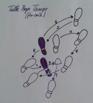
Ready to try this out for the recent ReGenring conference, I first looked into pre-produced bunting but decided against that as it would have been difficult to add comments once this was hanging – and I didn’t want to end up with un-displayed but filled in bunting at the end of the event. Rather, I wanted to find a way to allow delegates to secure their flags on the string without needing clips or a stapler, so tried out a folded version with a slot cut into both sides from opposite ends, so they could be slotted together (see the second way on the drawing below). In theory this worked well, but in practice this turned out to be over-designed, most people ended up just folding their flags over the string which worked just as well if not better than a complicated slotting maneouvre. (Although if the event had been outdoors that might have been a different matter.)

a very basic drawn instruction on how to make feedback bunting work
Having explained the idea during my part of the Welcome, I left flags on the tables for people to start filling up (which started pretty much immediately). During the Sharing Session in the afternoon I could be found walking around pressing some more onto people while asking “Have you left some feedback yet?” Maybe I was slightly too pushy, but it was really lovely to see the bunting chain grow over the course of the day.
I will definitely be using this simple, but effective, way of collecting feedback again and would recommend it for events big and small.
I am also thinking that this might be a fun way to organise a to-do list. I always have a number of projects on the go, and having one per flag would remind me of those projects and give me some space to add notes (and if I run out of space on one flag, I can always add another one). Plus as urgencies and priorities change, the order of these flags could be easily switched around. Something to try out in the next few days, I think 🙂